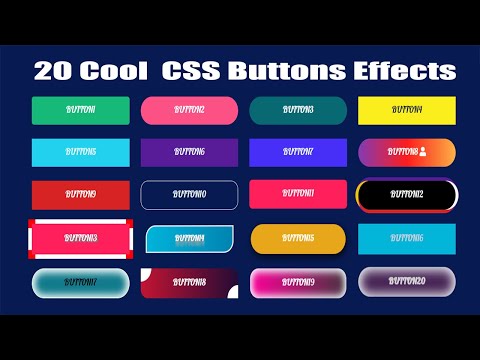
50 Cool CSS Buttons for Endless Design Inspirations – WebTopic
When it comes to call to action, buttons play a significant role. That’s why one should ensure that they stand out. How do you make sure of that? As a developer, you need not worry because it is easy to ensure that buttons grab site users’ attention. For a detailed discussion of 50 cool CSS buttons worth considering, keep reading.
Cool CSS Buttons1. Submit Button
See the Pen Submit Button (Anime.js) by Andrew Millen (@andrewmillen) on CodePen.
As the name suggests, this is a cool CSS button for the submit function. Its author Andrew Millen used HTML, CSS, and JS. The CSS is SCSS, to be precise, whereas the JS is a combination of jQuery and anime.js.
2. Button Hover Effect with Box-Shadow
See the Pen Button hover effects with box-shadow by Giana (@giana) on CodePen.
The button has a colorful border, to begin with. Upon hovering on it, its background changes from black to the border’s color, filling the button. Its author is Giana, who used both HTML and CSS, precisely SCSS.
3. Squishy Toggle Buttons
See the Pen Squishy Toggle Buttons by Justin Windle (@soulwire) on CodePen.
If you want to prevent toggle buttons, this set of two white on and off buttons is a perfect choice. Expect animation upon clicking on them too. The author Justin Windle choose HTML and CSS (Sass) to create these cool CSS buttons.
4. Who doesn’t like Fun Buttons?
See the Pen CSS BUTTONS!! by Derek Morash (@derekmorash) on CodePen.
These buttons are indeed fun with different animations. Some change the fill color, others have two colors, while others take up the border’s color upon hovering.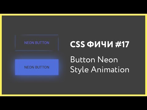 The options also come in different shapes. That’s amazing, and visitors will love engaging with such buttons. The author Derek Morash used HTML and CSS (SCSS) to create these inspiring buttons.
5. Button Bubble Effect
See the Pen Button bubble effect by Adrien Grsmto (@Grsmto) on CodePen.
The name says it all since, upon hovering on these cool CSS buttons, bubbles pop from two of their corners. In addition to that, the background color changes, and it keeps changing every time. The author Adrien Grsmto used HTML, JS, and CSS (SCSS).
6. Gooey Menu
See the Pen Gooey Menu by Lucas Bebber (@lbebber) on CodePen.
On the other hand, these cool CSS buttons are ideal for showing a hidden menu, especially on a mobile phone, which is common in achieving web responsiveness. Upon hovering on it, there is an animation hard to miss. The background color is also beautiful. The author Luca Bebber used HTML and CSS (SCSS).
7. Pure CSS Button with Ring Indicator
See the Pen Pure CSS Button with Ring Indicator by Cole McCombs (@mccombsc) on CodePen.
This is a button with an eye-catching shape and a colorful background. Equally important, circular waves keep emanating from the button to grab the website user’s attention. Its author Cole McCombs used HTML and CSS to create this beautiful button.
8. CSS Button Hover
See the Pen CSS BUTTON HOVER by Imran Pardes (@folaad) on CodePen.
The visible NEXT label on the button is most suitable for prompting users to click it for further steps of a process. There is animation and a change in the color of shadow after a hover. Its author Imran Pardes used HTML and CSS.
9. Collection of Button Hover Effects
See the Pen Collection of Button Hover Effects by David Conner (@davidicus) on CodePen.
The collection contains several buttons. Each one of them has a different border or background. Regardless of the one you settle for, it will definitely grab the attention of your site’s visitors. Its author David Conner uses HTML and CSS (SCSS).
10. Fancy Buttons
See the Pen CSS Button Effect by Alexandre do Vale (@alexandrevale) on CodePen.
They are quite fancy with beautiful borders and backgrounds that sometimes change on hover. One of them is perfect for an eCommerce site to notify customers about discounts. Its author Alexandre do Vale, used HTML, CSS, and JS.
11. Button Flip
See the Pen Auto Width Css Button Flip by Alex Moore (@MoorLex) on CodePen.
This button literally flips upon hovering over it. As it flips, it forms a lovely 3-D cuboid perfect for grabbing someone’s attention besides making it attractive. Both sides also have different background colors; hence hard to miss the animation. The author Alex Moore used HTML and CSS (SCSS).
12. Button Change
See the Pen Css Button Hover #5 by thelaazyguy (@thelaazyguy) on CodePen.
The brain behind these cool CSS buttons is thelaazyguy. The developer used HTML and CSS to develop an amazing animation effect upon hovering over this button with a black background. Its border and background change to green and white, respectively.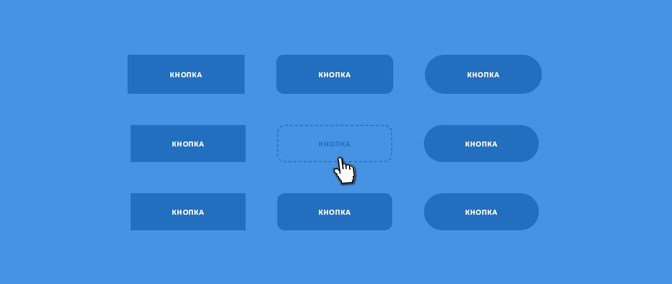 The font color also changes from white to green. Last but not least, an additional shape with an arrow pops up.
13. Sliced Button
See the Pen CSS Sliced Button by Sarah (@saraharaya) on CodePen.
It is interesting and eye-catching how the button is sliced into two upon hovering on it. Its author Sarah used HTML and CSS to bring out that effect.
14. Flush button
See the Pen Flush button by AbhishekBaiju (@abhishekbaiju) on CodePen.
The colorful background color and the attractive font and font color are bound to easily catch the visitor’s attention. As if that’s not enough, hovering on it results in a hard-to-miss animation. The button gains two colors for each half, upper and lower halves. The author AbhishekBaiju uses HTML and CSS.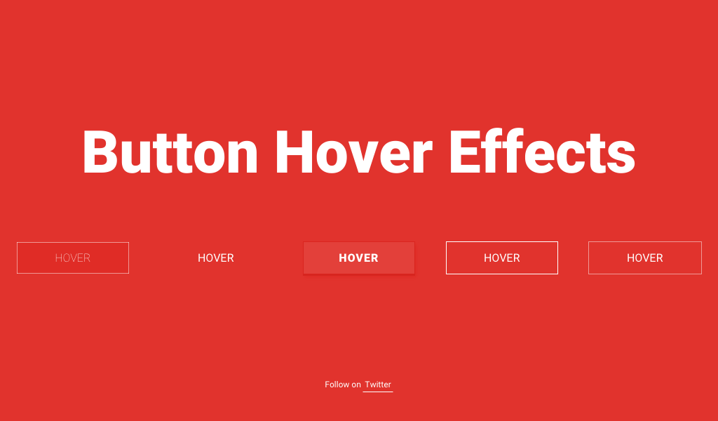
15. CSS Fizzy Button
See the Pen CSS Fizzy Button by Jürgen Leister (@webLeister) on CodePen.
At a glance, this button may look common and simple. However, upon hovering over it, the background color changes from black to white, and an icon emerges. Equally important, there is an animation similar to fireworks surrounding the button. Its author uses HTML (Haml) and CSS (SCSS) to develop these cool CSS buttons.
16. Bootstrap Buttons
See the Pen Pure CSS Button Loader | Bootstrap 4 | SCSS by dew31794 (@dew31794) on CodePen.
They are beautiful yet simple. Once you hover over it, nothing much happens other than the change of background cover. Nevertheless, that simple change is notable. The author dew31794 uses HTML, JS and CSS (SCSS).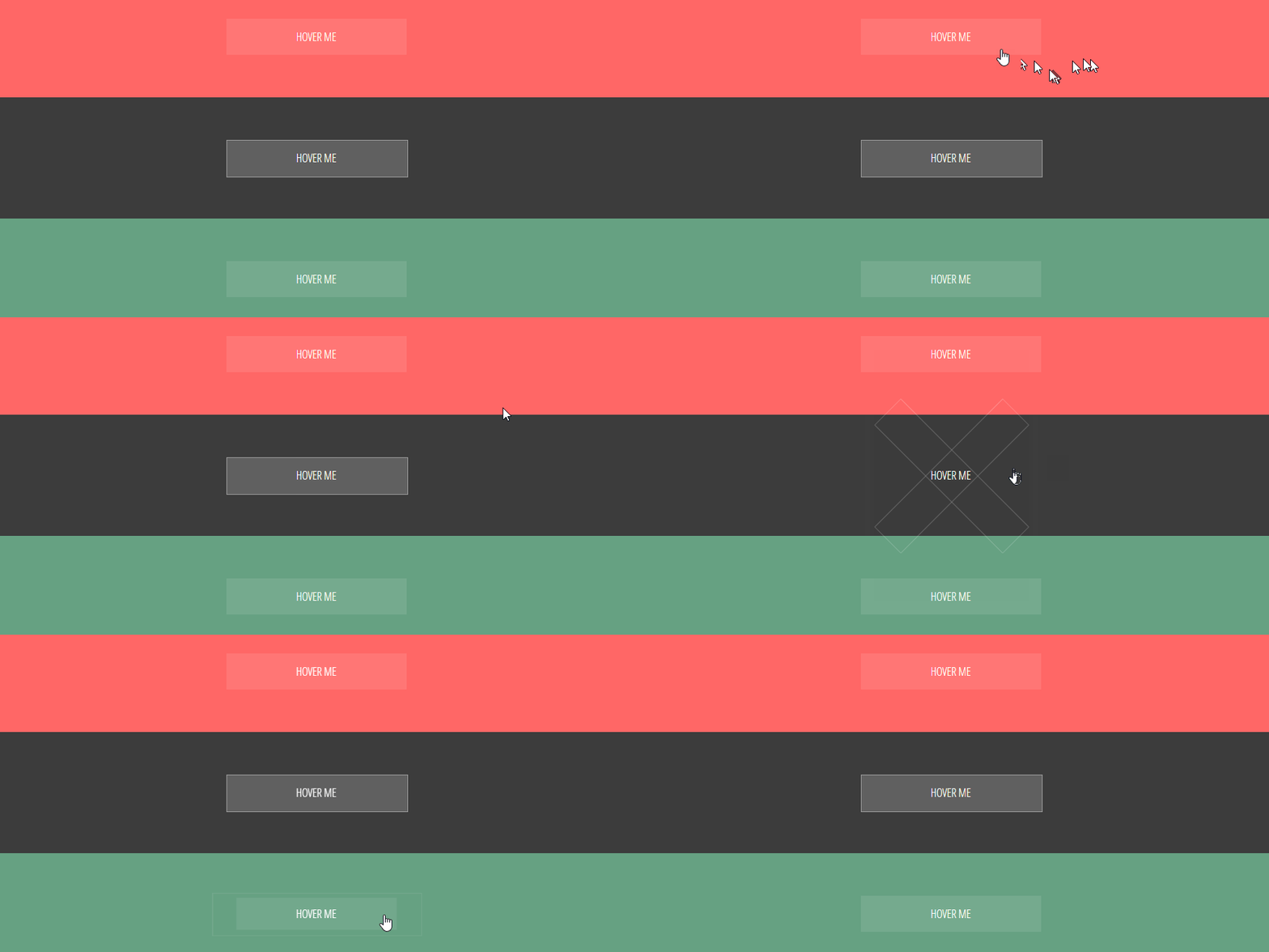
17. Blobs button
See the Pen Blobs button by Hilary (@hilwat) on CodePen.
This simple, beautiful, and eye-catching button has an animation effect upon hovering over it. It usually has a fluid-like effect as the background color changes from white to blue and vice versa for its label. The author Hilary used HTML and CSS (SCSS) to code it.
18. Blubby Button
See the Pen Bubbly Button by Nour Saud (@nourabusoud) on CodePen.
The colorful background color is eye-catching, no doubt. Additionally, upon clicking on this button, some bubbles emanate from the button hence the name blubby. Its author Nour Saud used HTML and CSS.
19. Hover Glow Effect
See the Pen Чистый CSS Button Hover Glow Effect by Kocsten (@kocsten) on CodePen.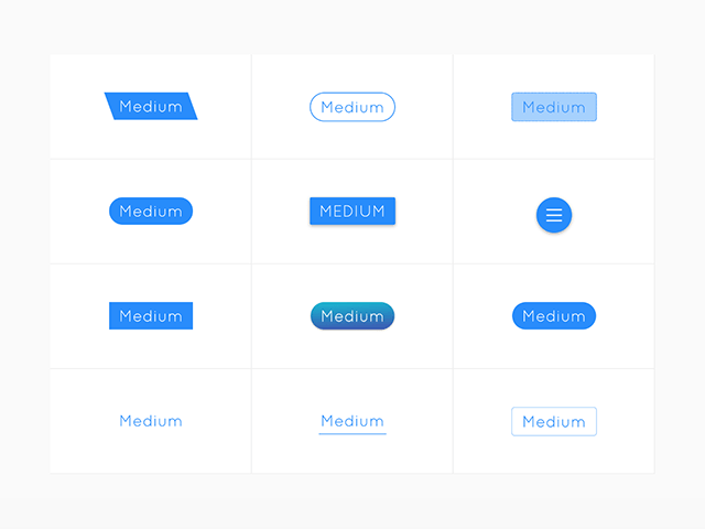
The default button isn’t eye-catching, to be honest. However, the colorful border that keeps changing color once you hover it is incredible. Upon clicking it, the background color also changes and keeps changing after every click. The glow effect is also hard to go unnoticed. Its author Kocsten used HTML and CSS.
20. Shiney Button
See the Pen Shiney Button by Jessica Biggs (@bigglesrocks) on CodePen.
The button has a blue border and a white background. The background colors change to blue upon hovering over it, and a shiny animation cuts across it once. The author, Jessica Biggs, used HTML and CSS.
21. CSS Animations: Obvious CTA button
See the Pen CSS Animations: Obvious CTA Buttons by Olivia Ng (@oliviale) on CodePen.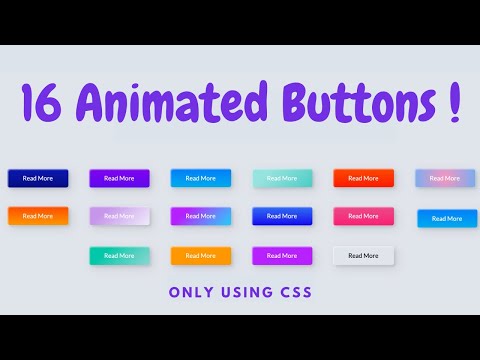
These cool CSS buttons are recommended for a call to action since they are hard to miss. Depending on the path you choose, the animation of the buttons or their borders is hard to miss. Its author Olivia Ng uses HTML and CSS.
22. Button with Gradient Shadow
See the Pen Button with gradient shadow by Mohsen Khakbiz (@Mohsen-Khakbiz) on CodePen.
These buttons have colorful backgrounds, icons, and texts coupled with a gradient shadow to stand out. The author Mohsen Khakbiz uses HTML and CSS.
23. Atom Button
See the Pen Atom Button by Paraskevas Dinakis (@perry_nt) on CodePen.
The button has a beautiful shape and a colorful border. Upon hovering on it, a small shiny circle starts rotating along the border. Its author Paraskevas Dinakis used HTML and CSS.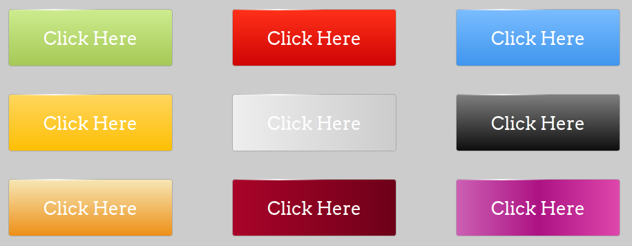
24. Six Pure CSS Button Hover Animations
See the Pen Six Pure CSS Button Hover Animations by Christian (@CTNieves) on CodePen.
Yes, you get a set of up to 6 cool CSS buttons. Hover triggers the animation effect characterized by a change of background color or shape. The author Christian used HTML and CSS.
25. Flat UI Buttons 2
See the Pen Flat UI Buttons 2 by Benjamin Gagne (@benngagne) on CodePen.
The simplicity is evident, but one must admit that the buttons are hard to go unnoticed. The border is striking, and so are the labels and background colors—the latter changes from dark to light shades upon hovering on the button. The author Benjamin Gagne used HTML and CSS.
26. Radio Button
See the Pen Radio Button by Andreas Storm (@avstorm) on CodePen.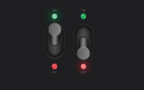
As the name suggests, the button is perfect for the radio input type. The color is green if yes but changes to red if the user chooses no. The author Andreas Storm used HTML and CSS.
27. Menu Button to Hamburger
See the Pen Menu button to Hamburger – styled & animated with pure CSS by Yinxi Chen (@kaylolo) on CodePen.
If you want your visitors to notice a collapsed menu right away, this CSS button will do the trick. The white button with three lines changes the color and icon depending on the option you choose. Its author Yinxi Chen used HTML and CSS.
28. Button Animation Experiment – Dribbble
See the Pen Button Animation Experiment – Dribbble by Kitsune (@kitsune) on CodePen.
The brain behind this cool CSS button is Kitsune. The author used HTML to create the animation effect, which makes the shape of the border change upon hovering over it.
29. Colored Cart Buttons
See the Pen Colored Cart Buttons by Scott Marshall (@ScottMarshall) on CodePen.
If you have an online store, these buttons are cool for the cart. They show the number of items in the cart, and their background color changes once you hover on it. The author Scott Marshall used HTML and CSS.
30. Animated CSS3 Buttons
See the Pen Animated CSS3 buttons by creotip (@creotip) on CodePen.
They are designed to ensure that a user notices the button. The button label and icon have different colors, and the animation effect comes after hovering or clicking it. The author creotip used HTML and CSS.
31. Prism Button Effect
See the Pen Prism Button Effect by Stix (@stix) on CodePen.
The button has an attractive background and border. Hovering on it leads to an animation that changes the direction of the button, its label, and background color with a prism-like movement. The author Stix used HTML and CSS.
32. Simple Radio Menu
See the Pen Simple radial menu by Nikolay Talanov (@suez) on CodePen.
It is a perfect style for a menu. Upon clicking on it, other buttons for the menu options pop up, forming a circle. The author Nikolay Talanov used HTML, CSS, and JS to code it.
33. Blurry Buttons
See the Pen AWESOME BLURRY BUTTONS by Scott Marshall (@ScottMarshall) on CodePen.
The buttons appear blur until you hover over them. You have different colors to choose from depending on your liking. The color you choose for the border is the same as the font of the label. Its author Scott Marshall used HTML, CSS, and JS.
34. Half Fuller Buttons
See the Pen Half Fuller Buttons by David Fuller (@half-fuller) on CodePen.
These buttons have a colorful border hence noticeable. At the same time, the background color changes from black to the color of the border if you hover on it. David Fuller used HTML and CSS to create these cool CSS buttons.
35. Animated Rainbow Button
See the Pen Animated Rainbow Button by lemmin (@lemmin) on CodePen.
The border of the button is as colorful as the rainbow. Equally important, there is an animation along the border hard to miss upon hovering on the button. Lemmin used HTML and CSS when coding the style.
36. Bop It Buttons
See the Pen Bop It Buttons by Dan Powell (@bloom-dan) on CodePen.
You have several options to choose from based on the animation you deem fit. The buttons can bop, flick, twist, or spin. They have a shadow border that disappears upon hovering over a button. Dan Powell used HTML and CSS.
37. Button Drop Shadow
See the Pen Button Drop Shadow by Robert Miller (@iamrobertmiller) on CodePen.
The button has a white background and a blue shadow. Upon hovering on it, the shadow disappears, and the background color changes to blue. Its author Robert Miller used HTML and CSS.
38. Dropdown Button
See the Pen Dropdown Button :: Pure CSS by Andy Tran (@andytran) on CodePen.
If you have a dropdown menu, this is a great choice to consider. It has a colorful background and an icon that emanates waves. Upon clicking on it, the dropdown menu appears. Andy Tran used HTML and CSS.
39. Purely CSS Button
See the Pen Purely CSS Button by Jorge Reyes (@imreyesjorge) on CodePen.
It is a button that has two different shapes which change after every click alternatively. One must admit that it is stylish and eye-catching even by a glance. Its author Jorge Reyes uses HTML and CSS.
40. 3D Retro Buttons
See the Pen 3D Retro Buttons by Mike @ Titan Global Tech (@b1tn3r) on CodePen.
These are eye-catching cool CSS buttons that you can use on your website to grab the visitors’ attention. The set has different buttons for various functions, including retro button, loader, info, success, warning, and danger.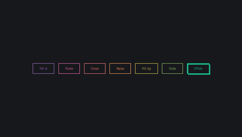 The colors and animations are different. Mike @ Titan Global Tech used HTML, CSS, and JS.
41. Rounded Button
See the Pen Pure Css Button Hover effect by alticreation (@alticreation) on CodePen.
Besides being rounded, the button also has an attractive background. Expect interesting animation and a change in background color upon hovering on it. The author, alticreation, used HTML and CSS (SCSS).
42. Icon buttons
See the Pen Icon buttons by Andrea Maselli (@andrea-maselli) on CodePen.
Besides having labels, these buttons also have icons. Upon hovering on them, the colors change to a darker shade. The author Andrea Maselli used HTML and CSS.
43. Thin Buttons
See the Pen Simple CSS Button Hover Effects by Natalia Reshetnikova (@natalia-reshetnikova) on CodePen.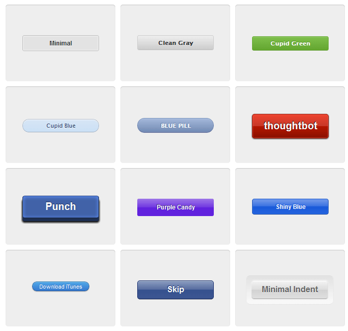
This set of cool CSS buttons has different background colors. Equally important, their animations are different once you hover over them. Their author Natalia Reshetnikova used HTML and CSS.
44. Rounded Pulse Button
See the Pen CSS Button With Hover Effect by Raj Kamal Chenumalla (@avvign) on CodePen.
It has rounded side borders and white background. Once you hover over it, expect a wavy animation; hence stands out perfectly. The author Raj Kamal uses HTML and CSS (SCSS).
45. Button N° 045
See the Pen 100 days css Button N° 045 by Vitor Siqueira (@vitor-siqueira) on CodePen.
The button is simple but changes once you hover over it. After all, it animates the border enough to grab the attention of the visitor. Its author Vitor Siqueira used HTML and CSS.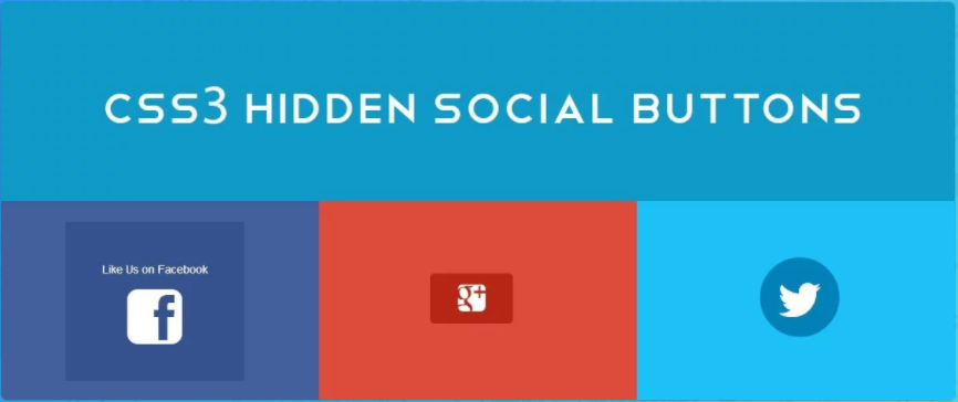
46. Button Concept
See the Pen Button Concept by Shyam (@Shtam3x) on CodePen.
The button has a label and an icon. Upon hovering on the button, the label disappears, leaving the icon behind. Upon clicking on it, the background color and icon change. Its author Shyam used CSS (SCSS), HTML and JS (CoffeeScript).
47. More Fancy Icons Button
See the Pen Pure CSS Buttons by Ishaan Saxena (@ishaansaxena) on CodePen.
Instead of labels, the buttons have icons and a colorful border. Hovering on it or clicking it brings an animation effect and changes the background color. The author Ishaan Saxena used HTML (Pug) and CSS (SCSS).
48. Simple Button
See the Pen CSS button by Tiberiu Raducea (@tyberiu88) on CodePen.
The word says it all, but the simplicity doesn’t make it hard to notice at all. It has a colorful background that changes to a darker or lighter shade. The author Tiberiu Raducea used HTML and CSS (SCSS).
49. Swipe Right Button
See the Pen Css Button Hover #2 – Background by thelaazyguy (@thelaazyguy) on CodePen.
Upon swiping to the right, the background color changes from white to red. It goes back to white once you stop. Its author, thelaazyguy, used HTML and CSS.
Source
50. FlipCover Buttons – Cool CSS Buttons
See the Pen FlipCover CSS Mixin by Velina V Veleva (@vveleva) on CodePen.
The cool CSS button has an attractive background color and icons. Upon hovering on them, they flip and expose additional information. The author Velina V Veleva used HTML, JS, and CSS (SCSS).
кнопок | Primer CSS
Стабильный
Просмотреть исходный кодНа этой странице
Кнопки используются для действий , как в формах, а текстовые гиперссылки используются для пунктов назначения или перехода с одной страницы на другую.
Примечание. При использовании элемента , всегда указывайте тип .
Типы кнопок
По умолчанию
Используйте стандартные — но стильные — .btn для действий формы и общих действий страницы. Они широко используются на сайте.
Основные
Основные кнопки зеленого цвета и используются для обозначения основных действий на странице.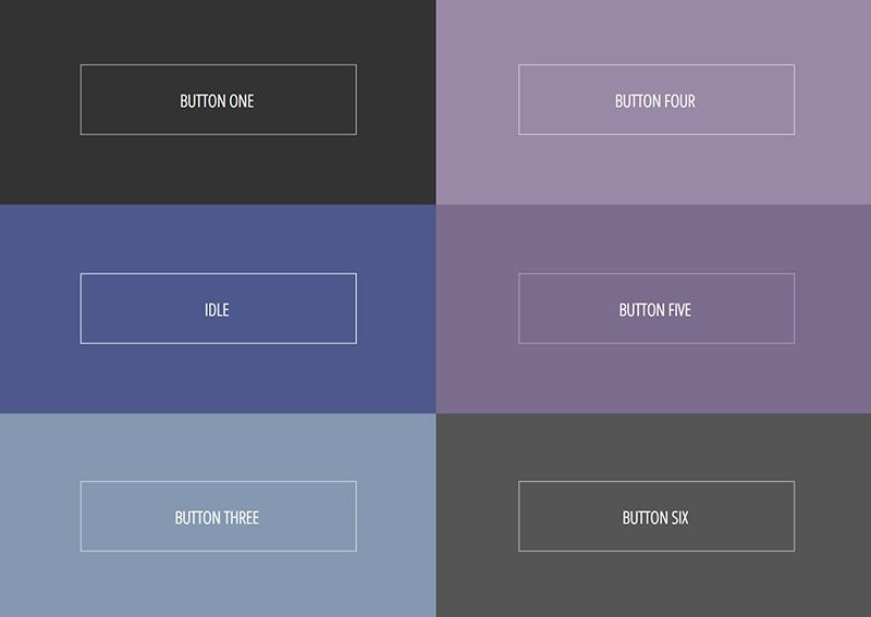 Если вам нужно, чтобы ваши кнопки выделялись, используйте
 .btn.btn-primary . Вы можете использовать его с кнопками обоих размеров — просто добавьте .btn-primary .
Контур
Кнопки контура преуменьшают действие, поскольку они выглядят как прямоугольные ссылки. Просто добавьте .btn-контур и вперед.
Опасность
Кнопки опасности красные. Они помогают повторить, что предполагаемое действие важно или потенциально опасно (например, удаление репо или передача права собственности). Подобно основным кнопкам, просто добавьте .btn-danger .
Selected
Добавление атрибута aria-selected="true" сохранит кнопку в выбранном состоянии.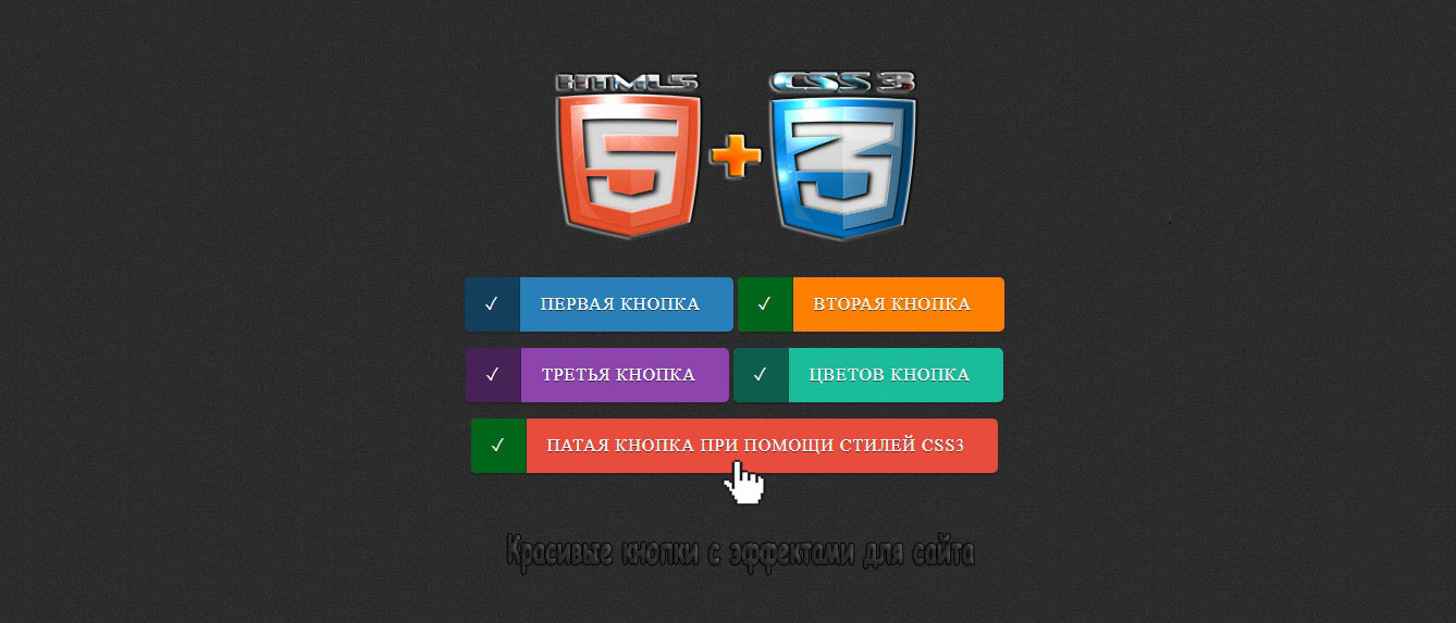 Обычно используется для
 BtnGroups .
<дел>
Отключено
Отключено и элементов с атрибутом aria-disabled="true" .
Варианты кнопок
Размеры
Далее к размеру по умолчанию есть еще . (маленький) и  btn-sm
 .btn-большой вариант . Используйте их, чтобы уменьшить или увеличить размер кнопки. Это полезно для установки кнопки рядом с входом или превращения кнопки в заметный призыв к действию в основных разделах.
При необходимости можно использовать утилиты масштабирования шрифта для изменения размера шрифта. Отступы применяются в em так, чтобы они масштабировались пропорционально размеру шрифта.
Использование .btn-large с утилитой масштабирования шрифта для преобразования текста в больший размер.
 btn-block
 BtnGroup
  BtnGroup-parent

