Основы стилизирования текста и шрифта — Изучение веб-разработки
В данной статье мы начнём путь к овладению стилизацией текста при помощи CSS. Мы подробно изучим основы стилизации текста и шрифта, такие как толщина, начертание, семейство, стенография, выравнивание текста и другие эффекты, а также рассмотрим междустрочный и межбуквенный интервалы.
| Необходимые знания: | Базовые компьютерные знания, Основы HTML (раздел Введение в HTML), основы CSS (раздел Введение в CSS). |
|---|---|
| Задача: | Изучить основные свойства и техники, необходимые для стилизации текста на веб-страницах. |
Как вы уже проверили в своей работе с HTML и CSS, текст внутри элемента выкладывается в поле содержимого элемента. Он начинается в левом верхнем углу области содержимого (или в правом верхнем углу, в случае содержимого языка RTL) и течёт к концу строки. Как только он достигает конца, он переходит к следующей строке и продолжает, затем к следующей строке, пока все содержимое не будет помещено в коробку.
<br>.Примечание: если приведённый выше абзац оставляет вас в замешательстве, то не имеет значения — вернитесь и просмотрите нашу статью о модели коробки, чтобы освежить теорию модели коробки, прежде чем продолжить.
Свойства CSS, используемые для стилизации текста, обычно делятся на две категории, которые мы рассмотрим отдельно в этой статье:
- Font styles: Свойства, влияющие на шрифт, применяемый к тексту, влияющие на то, какой шрифт применяется, насколько он велик, является ли он полужирным, курсивным и т. д.
- Text layout styles: Свойства, влияющие на интервал и другие особенности компоновки текста, позволяющие манипулировать, например, пространством между строками и буквами, а также тем, как текст выравнивается в поле содержимого.

Примечание: имейте в виду, что текст внутри элемента все затронуты как одна единая сущность. Вы не можете выбирать и стилизовать подразделы текста, если вы не обернёте их в соответствующий элемент (например, <span> или <strong>), или использовать текстовый псевдоэлемент, такой как ::first-letter (выделяет первую букву текста элемента),:: first-line (выделяет первую строку текста элемента) или ::selection (выделяет текст, выделенный в данный момент курсором.)
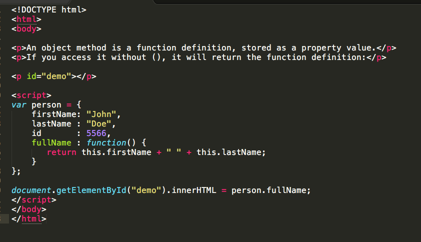
Давайте сразу перейдём к рассмотрению свойств для стилизации шрифтов. В этом примере мы применим некоторые различные свойства CSS к одному и тому же образцу HTML, который выглядит следующим образом:
<h2>Tommy the cat</h2>

<p>Well I remember it as though it were a meal ago...</p>

<p>Said Tommy the Cat as he reeled back to clear whatever foreign matter
 may have nestled its way into his mighty throat. Many a fat alley rat
had met its demise while staring point blank down the cavernous barrel of
 this awesome prowling machine.  Truly a wonder of nature this urban
predator — Tommy the cat had many a story to tell. But it was a rare
occasion such as this that he did.</p> Truly a wonder of nature this urban
predator — Tommy the cat had many a story to tell. But it was a rare
occasion such as this that he did.</p>
Truly a wonder of nature this urban
predator — Tommy the cat had many a story to tell. But it was a rare
occasion such as this that he did.</p>You can find the finished example on GitHub (see also the source code.)
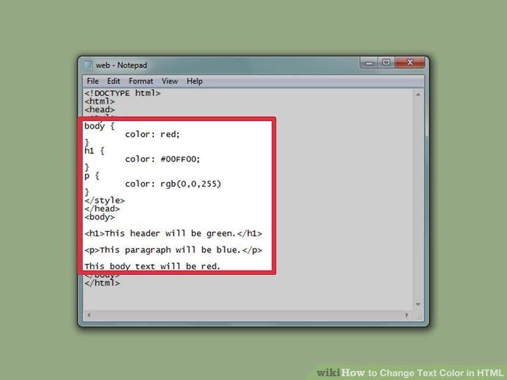
Color
The color (en-US) property sets the color of the foreground content of the selected elements (which is usually the text, but can also include a couple of other things, such as an underline or overline placed on text using the text-decoration (en-US) property).
color can accept any CSS color unit, for example:
p {
  color: red;
}
This will cause the paragraphs to become red, rather than the standard browser default black, like so:
Font families
To set a different font on your text, you use the font-family property — this allows you to specify a font (or list of fonts) for the browser to apply to the selected elements. The browser will only apply a font if it is available on the machine the website is being accessed on; if not, it will just use a browser default font. A simple example looks like so:
p {
  font-family: arial;
}
This would make all paragraphs on a page adopt the arial font, which is found on any computer.
Web safe fonts
Speaking of font availability, there are only a certain number of fonts that are generally available across all systems and can therefore be used without much worry. These are the so-called web safe fonts.
Most of the time, as web developers we want to have more specific control over the fonts used to display our text content. The problem is to find a way to know which font is available on the computer used to see our web pages. There is no way to know this in every case, but the web safe fonts are known to be available on nearly all instances of the most used operating systems (Windows, macOS, the most common Linux distributions, Android, and iOS).
The list of actual web safe fonts will change as operating systems evolve, but it’s reasonable to consider the following fonts web safe, at least for now (many of them have been popularized thanks to the Microsoft Core fonts for the Web initiative in the late 90s and early 2000s):
| Name | Generic type | Notes |
|---|---|---|
| Arial | sans-serif | It’s often considered best practice to also add Helvetica as a preferred alternative to Arial as, although their font faces are almost identical, Helvetica is considered to have a nicer shape, even if Arial is more broadly available. |
| Courier New | monospace | Some OSes have an alternative (possibly older) version of the Courier New font called Courier. It’s considered best practice to use both with Courier New as the preferred alternative. |
| Georgia | serif | |
| Times New Roman | serif | Some OSes have an alternative (possibly older) version of the |
| Trebuchet MS | sans-serif | You should be careful with using this font — it isn’t widely available on mobile OSes. |
| Verdana | sans-serif |
Note: Among various resources, the cssfontstack.com website maintains a list of web safe fonts available on Windows and macOS operating systems, which can help you make your decision about what you consider safe for your usage.
Note: There is a way to download a custom font along with a webpage, to allow you to customize your font usage in any way you want: web fonts. This is a little bit more complex, and we will be discussing this in a separate article later on in the module.
Default fonts
CSS defines five generic names for fonts: serif, sans-serif, monospace, cursive and fantasy. Those are very generic and the exact font face used when using those generic names is up to each browser and can vary for each operating system they are running on. It represents a worst case scenario where the browser will try to do its best to provide at least a font that looks appropriate. serif, sans-serif and monospace are quite predictable and should provide something reasonable. On the other hand, cursive and fantasy are less predictable and we recommend using them very carefully, testing as you go.
The five names are defined as follows:
| Term | Definition | Example |
|---|---|---|
serif | Fonts that have serifs (the flourishes and other small details you see at the ends of the strokes in some typefaces) | My big red elephant |
sans-serif | Fonts that don’t have serifs. | My big red elephant |
monospace | Fonts where every character has the same width, typically used in code listings. | My big red elephant |
cursive | Fonts that are intended to emulate handwriting, with flowing, connected strokes. | My big red elephant |
fantasy | Fonts that are intended to be decorative. | My big red elephant |
Font stacks
Since you can’t guarantee the availability of the fonts you want to use on your webpages (even a web font could fail for some reason), you can supply a font stack so that the browser has multiple fonts it can choose from. This simply involves a
 font-family value consisting of multiple font names separated by commas, e.g.
p {
  font-family: "Trebuchet MS", Verdana, sans-serif;
}
In such a case, the browser starts at the beginning of the list and looks to see if that font is available on the machine. If it is, it applies that font to the selected elements. If not, it moves on to the next font, and so on.
It is a good idea to provide a suitable generic font name at the end of the stack so that if none of the listed fonts are available, the browser can at least provide something approximately suitable. To emphasise this point, paragraphs are given the browser’s default serif font if no other option is available — which is usually Times New Roman — this is no good for a sans-serif font!
Note: Font names that have more than one word — like Trebuchet MS — need to be surrounded by quotes, for example "Trebuchet MS".
A font-family example
Let’s add to our previous example, giving the paragraphs a sans-serif font:
p {
  color: red;
  font-family: Helvetica, Arial, sans-serif;
}
This gives us the following result:
Font size
In our previous module’s CSS values and units article, we reviewed length and size units. Font size (set with the font-size property) can take values measured in most of these units (and others, such as percentages), however the most common units you’ll use to size text are:
px(pixels): The number of pixels high you want the text to be. This is an absolute unit — it results in the same final computed value for the font on the page in pretty much any situation.ems: 1emis equal to the font size set on the parent element of the current element we are styling (more specifically, the width of a capital letter M contained inside the parent element. ) This can become tricky to work out if you have a lot of nested elements with different font sizes set, but it is doable, as you’ll see below. Why bother? It is quite natural once you get used to it, and you can use emto size everything, not just text. You can have an entire website sized usingem, which makes maintenance easy.rems: These work just likeem, except that 1remis equal to the font size set on the root element of the document (i.e.<html>), not the parent element. This makes doing the maths to work out your font sizes much easier, although if you want to support really old browsers, you might struggle —remis not supported in Internet Explorer 8 and below.
 ) This can become tricky to work out if you have a lot of nested elements with different font sizes set, but it is doable, as you’ll see below. Why bother? It is quite natural once you get used to it, and you can use
 The font-size of an element is inherited from that element’s parent element. This all starts with the root element of the entire document — <html> — the font-size of which is set to 16px as standard across browsers. Any paragraph (or another element that doesn’t have a different size set by the browser) inside the root element will have a final size of 16
 px. Other elements may have different default sizes, for example an <h2> (en-US) element has a size of 2 em set by default, so it will have a final size of 32 px.
Things become more tricky when you start altering the font size of nested elements. For example, if you had an <article> element in your page, and set its font-size to 1.5 em (which would compute to 24 px final size), and then wanted the paragraphs inside the <article> elements to have a computed font size of 20 px, what em value would you use?
<article>
  <p>My paragraph</p>
</article>
You would need to set its em value to 20/24, or 0.83333333 em. The maths can be complicated, so you need to be careful about how you style things. It is best to use
 rem where you can, to keep things simple, and avoid setting the font-size of container elements where possible.
A simple sizing example
When sizing your text, it is usually a good idea to set the base font-size of the document to 10 px, so that then the maths is a lot easier to work out — required (r)em values are then the pixel font size divided by 10, not 16. After doing that, you can easily size the different types of text in your document to what you want. It is a good idea to list all your font-size rulesets in a designated area in your stylesheet, so they are easy to find.
Our new result is like so:
html {
  font-size: 10px;
}

h2 {
  font-size: 5rem;
}

p {
  font-size: 1.5rem;
  color: red;
  font-family: Helvetica, Arial, sans-serif;
}
Font style, font weight, text transform, and text decoration
CSS provides four common properties to alter the visual weight/emphasis of text:
font-style: Used to turn italic text on and off. Possible values are as follows (you’ll rarely use this, unless you want to turn some italic styling off for some reason):normal: Sets the text to the normal font (turns existing italics off.)italic: Sets the text to use the italic version of the font if available; if not available, it will simulate italics with oblique instead.oblique: Sets the text to use a simulated version of an italic font, created by slanting the normal version.
font-weight: Sets how bold the text is. This has many values available in case you have many font variants available (such as -light, -normal, -bold, -extrabold, -black, etc.), but realistically you’ll rarely use any of them except fornormalandbold:normal,bold: Normal and bold font weightlighter,bolder: Sets the current element’s boldness to be one step lighter or heavier than its parent element’s boldness.100–900: Numeric boldness values that provide finer grained control than the above keywords, if needed.
text-transform(en-US): Allows you to set your font to be transformed. Values include:none: Prevents any transformation.uppercase: Transforms all text to capitals.lowercase: Transforms all text to lower case.capitalize: Transforms all words to have the first letter capitalized.full-width: Transforms all glyphs to be written inside a fixed-width square, similar to a monospace font, allowing aligning of e.g. Latin characters along with Asian language glyphs (like Chinese, Japanese, Korean).
text-decoration(en-US): Sets/unsets text decorations on fonts (you’ll mainly use this to unset the default underline on links when styling them.) Available values are:none: Unsets any text decorations already present.underline: Underlines the text.overline: Gives the text an overline.line-through: Puts astrikethrough over the text.
text-decoration(en-US) can accept multiple values at once, if you want to add multiple decorations simultaneously, for exampletext-decoration: underline overline. Also note thattext-decoration(en-US) is a shorthand property fortext-decoration-line(en-US),text-decoration-style(en-US), andtext-decoration-color(en-US). You can use combinations of these property values to create interesting effects, for exampletext-decoration: line-through red wavy.
 Possible values are as follows (you’ll rarely use this, unless you want to turn some italic styling off for some reason):

Let’s look at adding a couple of these properties to our example:
Our new result is like so:
html {
  font-size: 10px;
}

h2 {
  font-size: 5rem;
  text-transform: capitalize;
}

h2 + p {
  font-weight: bold;
}

p {
  font-size: 1. 5rem;
  color: red;
  font-family: Helvetica, Arial, sans-serif;
} 5rem;
color: red;
font-family: Helvetica, Arial, sans-serif;
}
5rem;
color: red;
font-family: Helvetica, Arial, sans-serif;
}Text drop shadows
You can apply drop shadows to your text using the text-shadow property. This takes up to four values, as shown in the example below:
text-shadow: 4px 4px 5px red;The four properties are as follows:
- The horizontal offset of the shadow from the original text — this can take most available CSS length and size units, but you’ll most commonly use
px; positive values move the shadow right, and negative values left. This value has to be included. - The vertical offset of the shadow from the original text; behaves basically just like the horizontal offset, except that it moves the shadow up/down, not left/right. This value has to be included.
- The blur radius — a higher value means the shadow is dispersed more widely. If this value is not included, it defaults to 0, which means no blur. This can take most available CSS length and size units.
- The base color of the shadow, which can take any CSS color unit. If not included, it defaults to
black.

Multiple shadows
You can apply multiple shadows to the same text by including multiple shadow values separated by commas, for example:
text-shadow: 1px 1px 1px red,
             2px 2px 1px red;
If we applied this to the <h2> (en-US) element in our Tommy the cat example, we’d end up with this:
With basic font properties out the way, let’s now have a look at properties we can use to affect text layout.
Text alignment
The text-align property is used to control how text is aligned within its containing content box. The available values are as follows, and work in pretty much the same way as they do in a regular word processor application:
left: Left-justifies the text.right: Right-justifies the text.center: Centers the text.justify: Makes the text spread out, varying the gaps in between the words so that all lines of text are the same width. You need to use this carefully — it can look terrible, especially when applied to a paragraph with lots of long words in it. If you are going to use this, you should also think about using something else along with it, such ashyphens, to break some of the longer words across lines.

If we applied text-align: center; to the <h2> (en-US) in our example, we’d end up with this:
Line height
The line-height property sets the height of each line of text — this can take most length and size units, but can also take a unitless value, which acts as a multiplier and is generally considered the best option — the font-size is multiplied to get the line-height. Body text generally looks nicer and is easier to read when the lines are spaced apart; the recommended line height is around 1. 5 – 2 (double spaced.) So to set our lines of text to 1.6 times the height of the font, you’d use this:
line-height: 1.6;Applying this to the <p> elements in our example would give us this result:
Letter and word spacing
The letter-spacing and word-spacing properties allow you to set the spacing between letters and words in your text. You won’t use these very often, but might find a use for them to get a certain look, or to improve the legibility of a particularly dense font. They can take most length and size units.
So as an example, we could apply some word- and letter-spacing to the first line of each <p> element in our example:
p::first-line {
  letter-spacing: 4px;
  word-spacing: 4px;
}
Let’s add some to our example, like so:
Other properties worth looking at
The above properties give you an idea of how to start styling text on a webpage, but there are many more properties you could use. We just wanted to cover the most important ones here. Once you’ve become used to using the above, you should also explore the following:
Font styles:
Text layout styles:
text-indent: Specify how much horizontal space should be left before the beginning of the first line of the text content.text-overflow(en-US): Define how overflowed content that is not displayed is signaled to users.white-space: Define how whitespace and associated line breaks inside the element are handled.word-break: Specify whether to break lines within words.direction: Define the text direction (This depends on the language and usually it’s better to let HTML handle that part as it is tied to the text content.)hyphens: Switch on and off hyphenation for supported languages.line-break: Relax or strengthen line breaking for Asian languages.text-align-last: Define how the last line of a block or a line, right before a forced line break, is aligned.text-orientation(en-US): Define the orientation of the text in a line.overflow-wrap: Specify whether or not the browser may break lines within words in order to prevent overflow.writing-mode: Define whether lines of text are laid out horizontally or vertically and the direction in which subsequent lines flow.

In this active learning session, we don’t have any specific exercises for you to do: we’d just like you to have a good play with some font/text layout properties, and see what you can produce! You can either do this using offline HTML/CSS files, or enter your code into the live editable example below.
If you make a mistake, you can always reset it using the Reset button.
You’ve reached the end of this article, and already did some skill testing in our Active Learning section, but can you remember the most important information going forward? You can find an assessment to verify that you’ve retained this information at the end of the module — see Typesetting a community school homepage.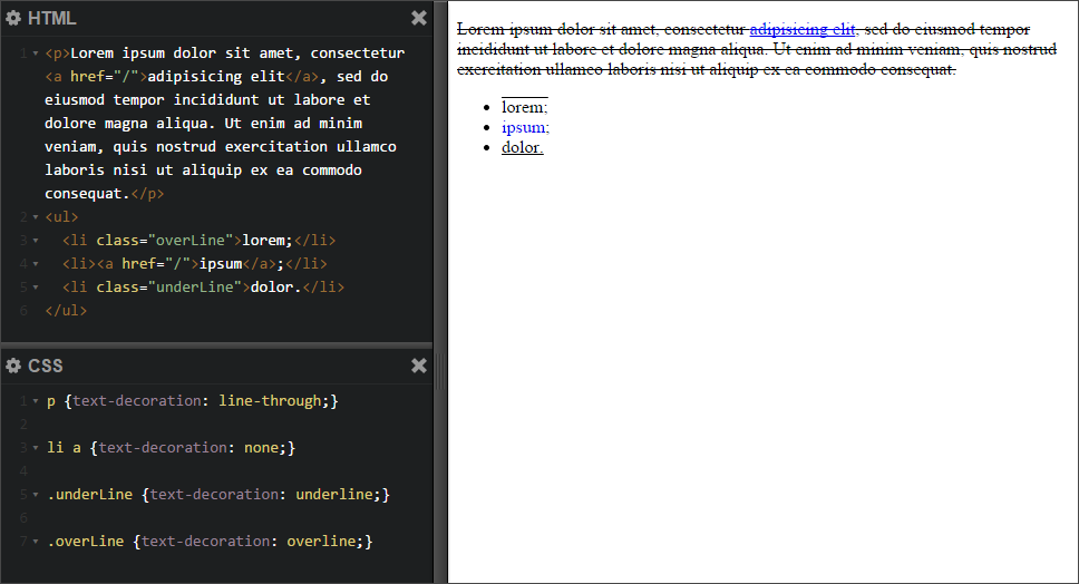
This assessment tests all the knowledge discussed in this module, so you might want to read the other articles before moving on to it.
We hoped you enjoyed playing with text in this article! The next article will give you all you need to know about styling HTML lists.
Текстовые эффекты • Про CSS
В посте представлены некоторые эффекты на основе text-shadow.
text-shadow — это свойство, описывающее тень, отбрасываемую текстом. В отличие от box-shadow, тень не обрезается фигурой, ей нельзя задать размер (только радиус размытия) и она не поддерживает параметр inset, то есть нельзя сделать внутреннюю тень.
Тем не менее, используя несколько теней с различными параметрами можно сделать имитацию обводки (которую было бы проще получить, если бы тень поддерживала размер) и имитацию внутренней тени, что позволяет сделать вдавленный текст.
Сочетая тени, градиенты и псевдо-элементы можно сделать много интересного.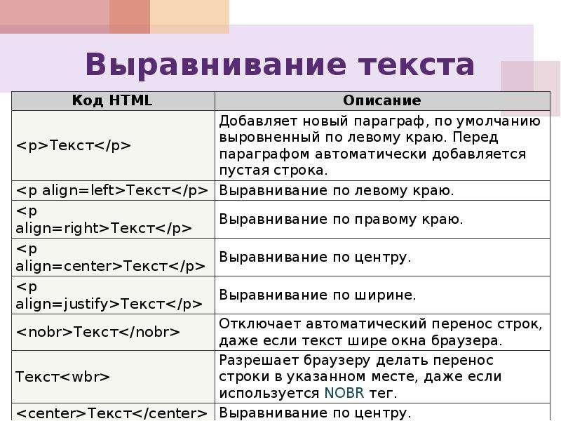
Проведите курсором над текстом примеров, чтобы увидеть эффекты при наведении.
Выпуклый текст
h2 {
  text-shadow:
    1px 1px 1px silver,
    -1px 1px 1px silver;
  color: white;
  transition: all .5s;
}

h2:hover {
  text-shadow:
    -1px -1px 1px silver,
    1px -1px 1px silver;
  color: white;
}
Вдавленный текст
h2 {
  text-shadow:
    -1px -1px #000,
    0 1px 0 #444;
  color: #222;
  transition: all 1s;
}

h2:hover {
  text-shadow:
    -1px -1px #000,
    0 1px 0 #444;
  color: #1A1A1A;
}
Размытие
h2 {
  font-size: 50px;
  font-weight: normal;
  cursor: pointer;
  text-shadow: 0 0 15px #999;
  color: transparent;
  transition: all .5s;
}

h2:hover {
  text-shadow: 0 0 0 #333;
}
Контуры
h2 {
  text-shadow:
    1px 1px 0 orange,
    1px -1px 0 orange,
    -1px 1px 0 orange,
    -1px -1px 0 orange;
  color: white;
  transition: all 1s;
}

h2:hover {
  text-shadow:
    1px 1px 0 yellowgreen,
    1px -1px 0 yellowgreen,
    -1px 1px 0 yellowgreen,
    -1px -1px 0 yellowgreen;
  }
h2 {
text-shadow:
-1px -1px #FFF,
-2px -2px #FFF,
-1px 1px #FFF,
-2px 2px #FFF,
1px 1px #FFF,
2px 2px #FFF,
1px -1px #FFF,
2px -2px #FFF,
-3px -3px 2px #BBB,
-3px 3px 2px #BBB,
3px 3px 2px #BBB,
3px -3px 2px #BBB;
color: steelblue;
transition: all 1s;
}
h2:hover {
color: yellowgreen;
}Для создания контура вокруг текста можно воспользоваться SCSS-функцией.
Длинные тени
h2 {
  text-shadow:
    1px 1px 0 hsl(20,100%,50%),
    2px 2px 0 hsl(20,100%,50%),
    3px 3px 0 hsl(35,100%,50%),
    4px 4px 0 hsl(35,100%,50%),
    5px 5px 0 hsl(45,100%,50%),
    6px 6px 0 hsl(45,100%,55%),
    7px 7px 0 hsl(55,100%,60%),
    8px 8px 0 hsl(55,100%,65%);
  color: hsl(0,100%,40%);
  transition: all 1s;
}

h2:hover {
  text-shadow:
    1px -1px 0 hsl(290,100%,40%),
    2px -2px 0 hsl(290,100%,40%),
    3px -3px 0 hsl(280,100%,60%),
    4px -4px 0 hsl(280,100%,60%),
    5px -5px 0 hsl(270,100%,75%),
    6px -6px 0 hsl(270,100%,80%),
    7px -7px 0 hsl(260,100%,85%),
    8px -8px 0 hsl(260,100%,90%);
  color: hsl(300,100%,30%);
}
Полосатая тень
h2 {
  display: inline-block;
  position: relative;
  letter-spacing: .05em;
  text-shadow:
    1px 1px mediumturquoise,
    -1px 1px mediumturquoise,
    -1px -1px mediumturquoise,
    1px -1px mediumturquoise;
  color: white;
  transition: all 1s;
}

h2:before {
  content: "";
  position: absolute;
  top: 10px;
  right: -15px;
  bottom: -15px;
  left: 0;
  z-index: -1;
  background: linear-gradient(
    -45deg,
    rgba(72, 209, 204, 0) 2px,
    mediumturquoise 3px,
    rgba(72, 209, 204, 0) 3px )
    repeat;
  background-size: 4px 4px;
}

h2:after {
  content: attr(data-name);
  position: absolute;
  top: 2px;
  left: 2px;
  z-index: -2;
  text-shadow:
    1px 1px white,
    2px 2px white,
    3px 3px white,
    4px 4px white;
  color: white;
  transition: all 1s;
}

h2:hover {
  color: lemonchiffon;
}

h2:hover:before {
  animation: 5s move_lines infinite linear;
}

h2:hover:after {
  color: lemonchiffon;
  text-shadow:
    1px 1px lemonchiffon,
    2px 2px lemonchiffon,
    3px 3px lemonchiffon,
    4px 4px lemonchiffon;
}

@keyframes move_lines {
  100% {
    background-position: 40px 40px;
  }
}
Идея не моя, найдено тут: codepen. io/lbebber/pen/BzoHi
Живое подчеркивание
h2 {
  display: inline-block;
  text-shadow:
    1px 1px 1px white,
    1px -1px 1px white,
    -1px 1px 1px white,
    -1px -1px 1px white;
  color: steelblue;
  transition: all 1s;
}

h2:after {
  content: "";
  display: block;
  position: relative;
  z-index: -1;
  width: 100%;
  margin: auto;
  border-bottom: 3px solid steelblue;
  bottom: .15em;
  transition: all 1s;
}

h2:hover:after {
  width: 0%;
  border-bottom-width: 1px;
}
Подводка
h2 {
  text-shadow:
    1px 1px white,
    2px 2px #777;
  color: #333;
  transition: all 1s;
}

h2:hover {
  text-shadow:
    1px 1px white,
    2px 2px tomato;
  color: crimson;
}
Разъезжающийся текст
h2 {
  overflow: hidden;
  text-shadow:
    0 0 tomato,
    0 0 yellowgreen,
    0 0 skyblue;
  color: transparent;
  transition: all 1s;
}

h2:hover {
  text-shadow:
    -400px 0 tomato,
    400px 0 yellowgreen,
    0 0 skyblue;
  }
CSS Magic #3.
 Обводка для текста (text-stroke effect)
HTML/CSS 1 min
Итак, обводка для текста на css в целом несложно делается, однако прежде чем начнем — стоит понимать, что данный метод не сработает в IE. Если Вам не особо нужен IE — либо игнорим проблему, либо выкручиваемся (я покажу как это можно сделать). Поехали!
HTML
<div>Text with stroke.</div>
<div>Text with stroke.</div>
Самая обыкновенная разметка. Даже и останавливаться на ней неохота, разве что тут два текста, один будет под IE, другой — под все остальное.
CSS
.no-ie {
font-size: 4em;
-webkit-text-stroke: 1px darkgrey;
-webkit-text-fill-color: transparent;
margin-bottom: 2em;
}.ie {
font-size: 4em;
color: #fff;
text-shadow:
-0  -1px  0   #000000,
0   -1px  0   #000000,
-0   1px  0   #000000,
0    1px  0   #000000,
-1px -0   0   #000000,
1px  -0   0   #000000,
-1px  0   0   #000000,
1px   0   0   #000000,
-1px -1px 0   #000000,
1px  -1px 0   #000000,
-1px  1px 0   #000000,
1px   1px 0   #000000,
-1px -1px 0   #000000,
1px  -1px 0   #000000,
-1px  1px 0   #000000,
1px   1px 0   #000000;
}
Используем два -webkit-свойства -webkit-text-stroke и -webkit-text-fill-color для достижения нужного результата. Текст будет прозрачным и будет иметь красивую, нужную нам, обводку. Под IE идем другим путем — придется задать цвет тексту и
 text-shadow. Конкретно такой код может не сработать, поэтому вот вам генератор тени для текста.
Определять браузер можно любым доступным способом (благо их полно в интернете), но если нужно — я расскажу в отдельной статье как)
И по традиции пен:
Вот собственно и все. Простой, но полезный эффект. К сожалению, не лишенный недостатков, но ничего в мире не бывает идеально.
До скорых встреч!)
Об авторе блога
MaxGraph
Автор. Веб-разработчик. Фрилансер. Преподаватель в онлайн-университете.
Портфолио: https://maxgraph.ru/
Добавляйтесь в друзья VK! Каждому добавившемуся и написавшему в личку «хочу полезность» — подарю набор крутых ссылок для верстальщика.
Форматирование текста в CSS
«Форматирование текста в CSS» – третий урок учебника CSS. Здесь мы поговорим об основных способах форматирования текста средствами CSS.
CSS предоставляют вебмастеру отличную возможность управления отображением текста. Изменение расстояния между символами, всевозможные отступы, стиль символов и управление шрифтами – это и многое другое позволяют изменять таблицы стилей.
Свойства, позволяющие форматировать текст в CSS.
Color – позволяет задает цвет элемента. В качестве параметра может выступать как шестнадцатиричное, так и буквенное значение цвета.
.red { color: red } | красный цвет |
Direction – позволяет изменить направление текста.
ltr – слева направо
rtl – справа налево.
| div.d1{ direction : ltr; } div.d2{ direction : rtl; } | Я текст, написанный слева – направо Я текст, написанный справа – налево |
К сожалению не во всех браузерах этот параметр будет отображаться правильно.
Letter – spacing – задает интервал между символами.
normal – обычные интервалы
length – пользовательский интервал.
| div.c { letter – spacing : 7px; } | Я текст, интервал между моими символами равен 5 пикселей. |
Text – align – задает выравнивание текста внутри элемента и может принимать значения:
- Left – выравнивает текст слева
- Right – выравнивает текст справа
- Center – выравнивает текст по центру
- Justify – выравнивает текст по ширине
| div.e1{ text – align : left; } div.e2{ text – align : right; } div.e3{ text – align : center; } div.e4{ text – align : justify; } | Left – выравнивает текст слева Right – выравнивает текст справа Center – выравнивает текст по центру Justify – выравнивает текст по ширине |
Text – decoration – оформление текста. Может принимать значения:
- None – обычный текст
- Underline – подчеркнутый снизу текст
- Overline – подчеркнутый сверху текст
- Line – through – зачеркнутый текст
- Blink – мигающий текст
| div.f1 { text – decoration : none; } div.f2 { text – decoration : underline; } div.f3 { text – decoration : overline; } div.f4 { text – decoration : line – through; } div.f5 { text – decoration : blink; } | None – определяет обычный текст Underline – подчеркивает текст снизу Overline – подчеркивает текст сверху Line – through – зачеркивает текст Blink – создает мигающий текст |
Text – indent – задает отступ для первой строки текста.
| div.g { text – indent : 25px; } | Отступ первой строки этого текста равен 25 пикселей. |

Text – transform – управляет размером символов и может принимать следующие значения:
- None – обычный текст
- Capitalize – каждое слово начинается с заглавной буквы.
- Uppercase – только большие буквы
- Lowercase – маленькие буквы
| div.h2 { text – transform : none; } div.h3 { text – transform : capitalize; } div.h4 { text – transform : uppercase; } div.h5 { text – transform : lowercase; } | определяет обычный текст. Каждое Слово Начинается С Заглавной Буквы. ОПРЕДЕЛЯЕТ ТОЛЬКО ЗАГЛАВНЫЕ БУКВЫ. только строчные символы. |
White – space – задает способ отображения пробелов и может принимать следующие значения:
- normal – допускается только один пробел.
- pre – вся структура документа, с неограниченным количеством пробелов сохраняется.
- nowrap – текст не будет переноситься , пока не встретит тег <br>
Word – spacing – задает интервал между словами.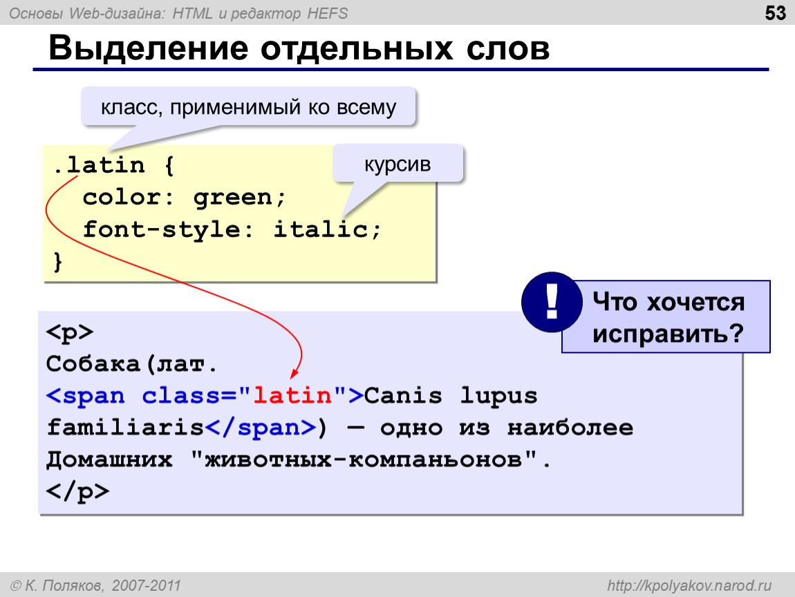
| div.i { word – spacing : 15px; } | Я текст, расстояние между словами которого равно 15 пикселей. |
Используя данные свойства вы без труда сможете отформатировать текст любой сложности надлежащим образом средствами CSS.
Работа со шрифтами в CSS.
Font – family – определяет список допустимых имен шрифтов для элемента. Использован будет первый, распознанный браузером шрифт.
| h2 { font – family : «Comic Sans MS», «Times New Roman»; } | текст шрифта comic sans , если его нет в системе, то шрифта times new roman |
Font – size – задает размер шрифта и может принимать значения:
- xx – small – наименьший
- x – small – очень маленький
- small – маленький
- medium – средний
- large – большой
- x – large – очень большой
- xx – large – наибольший
- smaller – меньше, чем у порождающего элемента
- larger – больше, чем у порождающего элемента
- length – задает фиксированное значение шрифта
- % – размер шрифта в % от размера шрифта порождающего элемента
div. j1 { j1 {font – size : xx – small; } div.j2 { font – size : medium; } div.j3 { font – size : xx – large; } div.j4 { font – size : 130%; } | Наименьший текст Средний текст Наибольший текст 130% от размера порождающего элемента |
Font – size – adjust – задает значение аспекта шрифта. Аспект шрифта – отношение между размерами маленькой буквыx и размером шрифта. Чем выше это значение, тем лучше шрифт будет читаться при уменьшении размера.
Font – stretch – позволяет задать интервал между символами внутри шрифта. Принимает значения:
- normal – Задает масштаб сжатия или расширения как обычный
- wider – Задает масштаб расширения как следующее расширенное значение
- narrower – Задает масштаб сжатия как следующее сжатое значение
- ultra – condenced – максимальный масштаб сжатия
- extra – condenced – сильный масштаб сжатия
- condenced – сжатие
- semi – condenced – слабое сжатие
- semi – expanded – слабое расширение
- expanded – расширение
- extra – expanded – сильный масштаб расширения
- ultra – expanded – максимальный масштаб расширения
div. k1 { k1 {font – stretch : wider; } div.k2 { font – stretch : narrower; } div.k3 { font – stretch : ultra – condensed; } div.k4 { font – stretch : ultra – expanded; } | следующее расширенное значение следующее сжатое значение максимальный масштаб сжатия максимальный масштаб расширения |
Font – style – задает стиль шрифта.
normal – нормальный шрифт.
italic – курсив.
oblique – наклонный шрифт.
| div.l1{ font – style : normal; } div.l2{ font – style : italic; } div.l3{ font – style : oblique; } | выводит обычный шрифт выводит курсивный шрифт наклонный шрифт |
Font – variant – используется для создания шрифта – капители (все маленькие символы преобразуются в большие).
normal – обычный шрифт
small – caps – шрифт – капиель.
| div.m1 { font – variant : normal; } div.m2 { font – variant : small – caps; } | normal – обычный шрифт small – caps – Выводит шрифт – капиель |
Font – weight – позволяет задать толщину символов:
- normal – обычные символы
- bold – жирные символы
- bolder – более жирные символы
- lighter – более тонкие символы
| div.n1 { font – weight : normal; } div.n2 { font – weight : bolder; } div.n3 { font – weight : lighter; } div.n4{ font – weight : 800; } | normal – Определяет обычные символы bolder – Определяет более жирные символы lighter – Определяет более тонкие символы Толщина задана численно |
Параметры размеров элементов CSS
Параметры, приведенные в таблице ниже позволяют управлять всеми возможными размерами элементов.
| Параметр | Описание | Значения |
|---|---|---|
| height | Задает высоту элемента | auto |
| length | ||
| % | ||
| line – height | Задает интервал между строками | normal |
| number | ||
| length | ||
| % | ||
| max – height | Задает максимальную высоту элемента | none |
| length | ||
| % | ||
| max – width | Задает максимальную ширину элемента | none |
| length | ||
| % | ||
| min – height | Задает минимальную высоту элемента | length |
| % | ||
| min – width | Задает минимальную ширину элемента | length |
| % | ||
| width | Задает ширину элемента | auto |
| % | ||
| length |
Сегодня мы разобрались с форматированием текста в CSS. Данный урок получился достаточно объемным, но он действительно важен для понимания основ работы с CSS. Теперь вы можете самостоятельно настроить отображение текстов средствами CSS, которые сильно опережают функционал HTML.
Правильно подобранный фон — неотъемлемый атрибут для любого качественного сайта и в следующем уроке мы поговорим о возможностях работы с фоном в CSS.
вёрстка — Как добавить линию за текст в css?
вёрстка — Как добавить линию за текст в css? — Stack Overflow на русскомStack Overflow на русском — это сайт вопросов и ответов для программистов. Присоединяйтесь! Регистрация займёт не больше минуты.
Присоединиться к сообществуЛюбой может задать вопрос
Любой может ответить
Лучшие ответы получают голоса и поднимаются наверх
Вопрос задан
Просмотрен 633 раза
На этот вопрос уже даны ответы здесь:
Закрыт 11 месяцев назад.
Как реализовать горизонтальную линию за текстом как на картинке?
Пробовал использовать свойство box-shadow — линия появляется ниже текста на несколько пикселей. Line-height не помогает т.к. меняется междустрочный интервал, а не отступ тени. Есть какое-нибудь свойство, которое указывает отступ box-shadow? Псевдоэлемент :after применяется ко всему тексту как к блоку, а не к строкам как на фото.
Как реализовать подобную линию? Заранее спасибо
задан 15 июл ’20 в 19:52
1h2 {
font-family: 'Roboto', Arial, sans-serif;
font-size: 48px;
max-width: 400px;
}
h2 span {
display: inline-block;
position: relative;
}
h2 span::before {
content: '';
position: absolute;
bottom: 20%; left: 0;
width: 100%; height: 20%;
background-color: orange;
z-index: -1;
}<h2>
<span>Наши партнеры</span>
<span>по бизнесу</span>
</h2>ответ дан 15 июл ’20 в 20:06
meinemeine7,21622 золотых знака99 серебряных знаков2424 бронзовых знака
- вот так ?
p{
  font-size: 40px;
  font-weight: bold;
  position: relative;
}
p:before{
  content: '';
  position: absolute;
  top: 30px;
  left: 0px;
  display: inline-block;
  width: 290px;
  max-width: 290px;
  height: 5px;
  z-index: -1;
  background-color: orange;
}
p:after{
  content: '';
  position: absolute;
  top: 80px;
  left: 0px;
  display: inline-block;
  width: 190px;
  max-width: 190px;
  height: 5px;
  z-index: -1;
  background-color: orange;
}
<p>наши партнеры <br>по бизнесу</p>ответ дан 15 июл ’20 в 20:05
LeksLeks2,46711 золотой знак77 серебряных знаков2727 бронзовых знаков
Всё ещё ищете ответ? Посмотрите другие вопросы с метками css вёрстка или задайте свой вопрос.
lang-css
Stack Overflow на русском лучше работает с включенным JavaScriptВаша конфиденциальность
Нажимая «Принять все файлы cookie» вы соглашаетесь, что Stack Exchange может хранить файлы cookie на вашем устройстве и раскрывать информацию в соответствии с нашей [Политикой в отношении файлов cookie] (https://stackoverflow.com/legal/cookie-policy).
Принять все файлы cookie Настроить параметры
Уроки HTML+CSS: Стили для текста (Часть 2)
Всем привет, продолжаем рассматривать CSS свойства для стилизации текста.
font-family — установка шрифтаДля того чтобы указать новый шрифт для текста прописываем свойство font-family с указанием названия шрифта и специальных параметров (начертание, стиль).
p {font-family: "Times New Roman", Georgia, Serif;}Основные правила установки шрифтов:
- параметры и название шрифта перечисляются через запятую
- если название шрифта состоит из нескольких слов, то его необходимо заключить в кавычки.
- можно использовать стандартные шрифты, подключать сторонние или самописные файлы. Как правильно подключать шрифты, вы можете посмотреть в этой записи — http://prog-time.ru/kak-pomenyat-shrift-na-sajte-kak-ustanovit-svoj-shrift/
font-style — стили для начертанияnormal | Значение по умолчанию, устанавливает для текста обычное начертание шрифта. |
italic | Выделяет текст курсивом. |
oblique | Устанавливает наклонное начертание шрифта. |
initial | Устанавливает значение свойства в значение по умолчанию. |
inherit | Наследует значение свойства от родительского элемента. |
p{font-style: italic;}Пример текста
p{font-style: oblique;}Пример текста
p{font-style: initial;}Пример текста
font-variant — начертание шрифтовnormal | Значение по умолчанию, выводит текст обычным начертанием. |
small-caps | Все строчные буквы заменяются на малые прописные, которые отличаются от обычных прописных слегка измененными пропорциями и уменьшенным размером. Очень похоже на text-transform: uppercase, отличие состоит в том, что здесь прописные буквы имеют разные размеры. |
initial | Устанавливает значение свойства в значение по умолчанию. |
inherit | Наследует значение свойства от родительского элемента. |
p{font-variant: small-caps;}Пример текста
font-weight — насыщенность шрифтаnormal | Значение по умолчанию, устанавливает нормальную насыщенность шрифта. Эквивалентно значению насыщенности, равной 400. |
bold | Делает шрифт текста полужирным. Эквивалентно значению насыщенности, равной 700. |
bolder | Насыщенность шрифта будет больше, чем у предка. |
lighter | Насыщенность шрифта будет меньше, чем у предка. |
100, 200, 300, 400, 500, 600, 700, 800, 900 | Значение 100 соответствует самому легкому варианту начертания шрифта, а 900 — самому плотному. При этом, эти числа не определяют конкретной плотности, т.е. 100, 200, 300 и 400 могут соответствовать одному и тому же варианту слабой насыщенности начертания шрифта; 500 и 600 — средней насыщенности, а 700, 800 и 900 могут выводить одинаковое очень насыщенное начертание. Распределение плотности так же зависит от количества уровней насыщенности, определенных в конкретном семействе шрифтов. |
initial | Устанавливает значение свойства в значение по умолчанию. |
inherit | Наследует значение свойства от родительского элемента. |
p{font-weight: bold;}Пример текста
p{font-weight: bolder;}Пример текста
p{font-weight: lighter;}Пример текста
.p1{font-weight: 100;}
.p2{font-weight: 200;}
.p3{font-weight: 300;}
.p4{font-weight: 400;}
.p5{font-weight: 500;}
.p6{font-weight: 600;}
.p7{font-weight: 700;}
.p8{font-weight: 800;}
.p9{font-weight: 900;}
.p10{font-weight: 1000;}
Пример текста
Пример текста
Пример текста
Пример текста
Пример текста
Пример текста
Пример текста
Пример текста
Пример текста
Пример текста
font-size — размер шрифтаabsolute-size | xx-small, x-small, small, medium, large, x-large, xx-large. Абсолютные размеры определены относительно друг друга и коэффициент масштабирования между двумя соседними абсолютными размерами составляет примерно 1,5 при переходе от меньшего к большему и 0,66 при переходе от большего к меньшему. В качестве стандартного размера принимается medium. |
relative-size | smaller, larger. Относительные размеры обусловливают изменение размера шрифта элемента относительно родителя. При этом размер шрифта может выйти за рамки размеров, предполагаемых для xx-small и xx-large. |
длина | Размер шрифта устанавливается с помощью положительных значений единиц длины — px, как целых, так и дробных. |
% | Относительное значение, вычисляется на основании любого размера, унаследованного от родительского элемента. Обеспечивает более точную настройку вычисляемого размера шрифта. Задание размеров шрифта с помощью em эквивалентно процентному значению. |
initial | Устанавливает значение свойства в значение по умолчанию. |
inherit | Наследует значение свойства от родительского элемента. |
p{font-size: 40px;}Пример текста
p{font-size: 50%;}Пример текста
text-decoration-lineСвойство text-decoration-line указывает расположение линии относительно текста.
| none | Значение по умолчанию |
| underline | Подчеркивание под текстом |
| overline | Подчеркивание над текстом |
| line-through | Добавляет линию перечеркивания |
| inherit | Наследует значение свойства от родительского элемента. |
| initial | Устанавливает значение свойства в значение по умолчанию. |
Свойство text-decoration-style указывает тип линии.
| solid | Добавляет отрезок простой линии. Значение по умолчанию. |
| double | Две параллельные сплошные линии с небольшим промежутком между ними. |
| dotted | Последовательность круглых точек. |
| dashed | Последовательность прямоугольных штрихов. |
| wavy | Указывает на волнистую линию. |
| inherit | Наследует значение свойства от родительского элемента. |
| initial | Устанавливает значение свойства в значение по умолчанию. |
text-decoration-color
Свойство text-decoration-color задает цвет для линии подчеркивания. Цвет задается в виде стандартного кода.
text-shadow
Свойство text-shadow задает тень для текста. Значение для данного свойства формируется подобно значению для свойства box-shadow.
text-shadow: 2px 3px 5px #3498db;Пример текста с тенью
Информация была взята с сайта — https://html5book.ru
justify | HTML и CSS с примерами кода
Свойство text-justify определяет какой тип выравнивания следует применить к тексту, когда text-align: justify; применяется к элементу.
Синтаксис
text-justify: none;
text-justify: auto;
text-justify: inter-word;
text-justify: inter-character;
text-justify: distribute; /* Устаревшее значение */
Значения
none- Выравнивание текста отключено. Оно имеет такой же эффект как отсутствие применение свойства
text-align, хотя оно полезно, если вам нужно включать и выключать выравнивание.
auto Браузер выбирает лучший тип выравнивания в текущей ситуации, основываясь на балансе между производительностью и качеством, а также на том, что более подходит для языка текста (например, английского, иероглифных языков, и т. п.). Оно используется по умолчанию, если text-justify не установлен.
inter-word Выравнивание текста по средствам добавления пробелов между словами (эффективно варьируя word-spacing), что наиболее подходит для языков, которые используют разделение слов пробелами, таких как английский или корейский.
inter-character Выравнивание текста по средствам добавления пробелов между символами (эффективно варьируя letter-spacing), что наиболее подходит для таких языков как японский.
distribute Показывает тоже поведение, что и inter-character это значение сохранилось для обратной совместимости.
Спецификация
Пример
p {
  font-size: 1.5em;
  border: 1px solid black;
  padding: 10px;
  width: 95%;
  margin: 10px auto;
  text-align: justify;
}

.none {
  text-justify: none;
}

.auto {
  text-justify: auto;
}

.dist {
  text-justify: distribute;
}

.word {
  text-justify: inter-word;
}

.char {
  text-justify: inter-character;
}
См. также
Ссылки
Текстовые эффекты CSS
Переполнение текста CSS, перенос слов, разрыв строки Правила и режимы записи
В этой главе вы узнаете о следующих свойствах:
-
переполнение текста -
перенос слов -
разрыв слов -
режим записи
Переполнение текста CSS
Свойство CSS text-overflow определяет, как переполняется содержимое, которое не
отображаемый должен быть сигнализирован пользователю.
Можно обрезать:
Это длинный текст, который не поместится в поле
или его можно представить в виде многоточия (…):
Это длинный текст, который не поместится в поле
Код CSS выглядит следующим образом:
Пример
p.test1 {белое пространство: nowrap;
ширина: 200 пикселей;
граница: сплошной 1px # 000000;
переполнение: скрыто;
переполнение текста: клип;
}
p.test2 {
white-space: nowrap;
ширина: 200 пикселей;
граница: сплошной 1px # 000000;
переполнение: скрыто;
переполнение текста: многоточие;
}
В следующем примере показано, как можно отобразить переполненное содержимое при наведении курсора на элемент:
Перенос слов в CSS
Свойство CSS word-wrap позволяет разбивать длинные слова и переносить их на следующую строку.
Если слово слишком длинное и не помещается в области, оно расширяется за пределы:
Этот абзац содержит очень длинное слово: это очень-очень-очень-очень-очень длинное слово. Длинное слово прерывается и переносится на следующую строку.
Свойство word-wrap позволяет принудительно переносить текст — даже если это означает разделение его посередине слова:
Этот абзац содержит очень длинное слово: это очень-очень-очень-очень-очень длинное слово. Длинное слово прерывается и переносится на следующую строку.
Код CSS выглядит следующим образом:
Пример
Разрешить разбивать длинные слова и переносить их на следующую строку:
p {
word-wrap: break-word;
}
Разбиение слов в CSS
Свойство CSS разрыв слова определяет правила разрыва строки.
Этот абзац содержит текст. Эта строка будет разрываться через дефис.
Этот абзац содержит текст. Строки будут разрываться у любого символа.
Код CSS выглядит следующим образом:
Пример
p.test1 {разрыв слова: сохранить все;
}
p.test2 {
разрыв слова:
сломать все;
}
Режим записи CSS
Свойство режима записи CSS определяет
расположены ли строки текста горизонтально или вертикально.
Некоторый текст с элементом span с режимом письма vertical-rl.
В следующем примере показаны несколько различных режимов записи:
Пример
п.test1 {режим письма: горизонтальный-tb;
}
span.test2 {
режим записи: vertical-rl;
}
p.test2 {
режим записи:
вертикальный-rl;
}
Проверьте себя упражнениями!
Свойства текстовых эффектов CSS
В следующей таблице перечислены свойства текстового эффекта CSS:
| Имущество | Описание |
|---|---|
| text-align-last | Задает способ выравнивания последней строки текста |
| с выравниванием текста | Указывает, как выравниваемый текст должен быть выровнен и с интервалом |
| переполнение текста | Указывает, как пользователю следует сигнализировать о переполненном содержимом, которое не отображается. |
| разрыв слова | Определяет правила разрыва строки для сценариев, отличных от CJK |
| перенос слов | Позволяет разбивать длинные слова и переносить их на следующую строку |
| режим письма | Задает расположение строк текста по горизонтали или по вертикали. |
Свойства текста CSS
Эта страница содержит свойства в пространстве имен text (свойства со словом text в своем имени), а также некоторые другие связанные свойства.
Помимо различных свойств шрифта CSS, существуют другие свойства, которые могут помочь в стилизации вашего текста. Например, вы можете изменить цвет текста, выровнять текст, добавить свойства оформления и многое другое.
В CSS можно стилизовать текст, используя свойства, перечисленные ниже. Используя этот список, вы можете узнать, как использовать каждое свойство текста css и как оно выглядит в браузере.
Цвет текста CSS
Для получения дополнительной информации см. Свойство color .
Цвет текста CSS оливковый
Выравнивание текста CSS
Для получения дополнительной информации см. Свойство text-align .
Этот текст CSS выровнен по правому краю
Отступ текста CSS
Отступает в первой строке абзаца.Для получения дополнительной информации см. Свойство text-indent .
Этот текст имеет отступ 50 пикселей.Это означает, что первая строка абзаца будет иметь отступ на 50 пикселей, но следующие строки не будут иметь отступа. Чтобы увидеть отступ, текст нужно будет обернуть - отсюда весь этот текст!
CSS Расстояние между буквами
Для получения дополнительной информации см. Свойство letter-spacing .
В этом тексте применен межбуквенный интервал
Интервал между словами CSS
Для получения дополнительной информации см. Свойство word-spacing .
В этом тексте применен интервал между словами
Оформление текста CSS
Для получения дополнительной информации см. Свойство text-decoration .
У этого текста есть линия сверху
В этом тексте есть линия посередине
Под этим текстом есть линия
У этой гиперссылки нет подчеркиванияПреобразование текста CSS
Для получения дополнительной информации см. Свойство text-transform .
Этот текст переведен на верхний регистр
ЭТОТ ТЕКСТ БЫЛ ПРЕОБРАЗОВАН НА НИЗКОЕ
этот текст был написан с заглавной буквы.
Направление текста CSS
Для получения дополнительной информации см. Свойство direction .
Этот текст идет справа налево.Это может быть полезно для языков, где текст идет справа налево. Но не так полезно для английского ...
CSS юникод-биди
Для получения дополнительной информации см. Свойство unicode-bidi .
Используйте это вместе со свойством direction для определения направления текста. Возможные значения: нормальный , встроенный , двунаправленный переход и наследование .
Этот текст идет справа налево.Это может быть полезно для языков, где текст идет справа налево. Но не так полезно для английского ...
Тень текста CSS
Для получения дополнительной информации см. Свойство text-shadow .
Если ваш браузер поддерживает свойство CSS text-shadow, этот текст будет иметь тень.
Пустое пространство CSS
Сообщает браузеру, как обрабатывать пробелы. Возможные значения: normal , pre и nowrap .
Для получения дополнительной информации см. Свойство white-space .
В этом тексте есть разрыв строки (на самом деле в нем много разрывов строк!) и предварительная настройка белого пространства говорит браузеру соблюдать это как предварительный тег HTML.
CSS | Форматирование текста - GeeksforGeeks
Свойства форматирования текста CSS используются для форматирования текста и стиля текста. Форматирование текста CSS
включает следующие свойства:
1.Цвет текста
2. Выравнивание текста
3. Декорирование текста
4. Преобразование текста
5. Отступ текста
6. Расстояние между буквами
7. Высота строки
8. Направление текста
9. Тень текста
10. Интервал между словами
1. ЦВЕТ ТЕКСТА
Свойство Цвет текста используется для установки цвета текста.
Цвет текста может быть установлен с использованием имени «красный», шестнадцатеричного значения «# ff0000» или его значения RGB «rgb (255, 0, 0).
Синтаксис:
тело
{
цвет: название цвета;
}
Пример:
0009 9 9 900 > |
ВЫХОД:
2.ВЫРАВНИВАНИЕ ТЕКСТА
Свойство выравнивания текста используется для установки горизонтального выравнивания текста.
Для текста можно задать выравнивание по левому и правому краю, по центру и по ширине.
При выравнивании по ширине линия растягивается так, что левое и правое поля остаются прямыми.
Синтаксис:
тело
{
text-align: тип выравнивания;
}
Пример:
0009 9 9 900 > |
ВЫХОД:
3.УКРАШЕНИЕ ТЕКСТА
Оформление текста используется для добавления или удаления украшений из текста.
Оформление текста может быть подчеркнутым, надчеркнутым, сквозным или отсутствовать.
Синтаксис:
тело
{
текст-украшение: тип оформления;
}
Пример:
0009 9 9 900 > |
ВЫХОД:
4.ПРЕОБРАЗОВАНИЕ ТЕКСТА
Свойство преобразования текста используется для изменения регистра текста, верхнего или нижнего регистра.
Преобразование текста может быть прописным, строчным или заглавным.
Заглавные буквы используются для изменения первой буквы каждого слова на прописную.
Синтаксис:
тело
{
текст-преобразование: тип;
}
Пример:
0009 9 9 900 > |
ВЫХОД:
5.ОБОЗНАЧЕНИЕ ТЕКСТА
Свойство отступа текста используется для отступа первой строки абзаца.
Размер может быть в пикселях, см, пт.
Синтаксис:
тело
{
текст-отступ: размер;
}
Пример:
0009 9 900 > |
6. ПРОБЕЛ БУКВ
Это свойство используется для указания пробела между символами текста.
Размер может быть указан в пикселях.
Синтаксис:
тело
{
межбуквенный интервал: размер;
}
Пример:
0009 9 900 > |
7. ВЫСОТА ЛИНИИ
Это свойство используется для установки расстояния между линиями.
Синтаксис:
тело
{
высота строки: размер;
}
Пример:
0009 9 900 > |
8. НАПРАВЛЕНИЕ ТЕКСТА
Свойство Направление текста используется для установки направления текста.
Направление может быть установлено с помощью rtl: справа налево.
Слева направо - направление текста по умолчанию.
Синтаксис:
тело
{
направление: RTL;
}
Пример:
0009 9 900 > |
ВЫХОД:
9. ТЕНЬ ТЕКСТА
Свойство тени текста используется для добавления тени к тексту.
Вы можете указать размер текста по горизонтали, вертикали и цвет тени.
Синтаксис:
тело
{
text-shadow: размер по горизонтали, размер по вертикали, имя цвета;
}
Пример:
0009 9 900 > |
10. ПРОБЕЛ СЛОВ
Межсловный интервал используется для указания расстояния между словами в строке.
Размер может быть указан в пикселях.
Синтаксис:
тело
{
межсловный интервал: размер;
}
Пример:
0009 9 900 > |
Форматирование текста с помощью CSS - Учебник Republic
Из этого туториала Вы узнаете, как стилизовать текст на своих веб-страницах с помощью CSS.
Форматирование текста с помощью CSS
CSS предоставляет несколько свойств, которые позволяют очень легко и эффективно определять различные стили текста, такие как цвет, выравнивание, интервал, оформление, преобразование и т. Д.
Обычно используемые свойства текста: выравнивание текста , украшение текста , преобразование текста , отступ текста , высота строки , межбуквенный интервал , интервал между словами , и больше.Эти свойства позволяют точно контролировать внешний вид символов, , слов, , пробелов, и т. Д.
Давайте посмотрим, как установить эти текстовые свойства для элемента более подробно.
Цвет текста
Цвет текста определяется свойством CSS color .
Правило стиля в следующем примере определит цвет текста по умолчанию для страницы
Хотя кажется, что свойство цвета будет частью текста CSS, но на самом деле это отдельное свойство в CSS.См. Руководство по цвету CSS, чтобы узнать больше о свойстве color.
Выравнивание текста
Свойство text-align используется для установки горизонтального выравнивания текста.
Текст можно выровнять четырьмя способами: по левому краю, по правому краю, по центру или по ширине (прямое левое и правое поля).
Давайте рассмотрим пример, чтобы понять, как в основном работает это свойство.
  h2 {
    выравнивание текста: центр;
}
п {
    выравнивание текста: выравнивание;
}
Примечание: Когда для text-align установлено значение justify , каждая строка растягивается так, чтобы каждая строка имела одинаковую ширину (кроме последней строки), а левое и правое поля были прямыми.Это выравнивание обычно используется в таких публикациях, как журналы и газеты.
Давайте посмотрим на следующую иллюстрацию, чтобы понять, что на самом деле означают эти значения.
Оформление текста
Свойство text-decoration используется для установки или удаления украшений из текста.
Это свойство обычно принимает одно из следующих значений: подчеркивание , надстрочное , сквозное и отсутствие .Вам следует избегать подчеркивания текста, который не является ссылкой, поскольку это может сбить с толку посетителя.
Давайте попробуем следующий пример, чтобы понять, как это в основном работает:
  h2 {
    текст-оформление: надстрочный;
}
h3 {
    текстовое оформление: сквозное;
}
h4 {
    текст-оформление: подчеркивание;
}
Удаление подчеркивания по умолчанию из ссылок
Свойство text-decoration широко используется для удаления подчеркивания по умолчанию из гиперссылок HTML.Вы также можете предоставить некоторые другие визуальные подсказки, чтобы выделить его из обычного текста, например, используя пунктирную рамку вместо сплошного подчеркивания.
Давайте посмотрим на следующий пример, чтобы понять, как это в основном работает:
  a {
    текстовое оформление: нет;
    нижняя граница: 1px с точками;
}
Примечание: При создании ссылки HTML браузеры, встроенные в таблицу стилей, автоматически подчеркивают ее и применяют синий цвет, чтобы читатели могли четко видеть, какой текст доступен для нажатия.
Преобразование текста
Свойство text-transform используется для установки регистра текста.
Текст часто пишется в смешанном регистре. Однако в определенных ситуациях вы можете захотеть отобразить свой текст в совершенно другом регистре. Используя это свойство, вы можете изменить текстовое содержимое элемента на прописные или строчные буквы или сделать первую букву каждого слова заглавной, не изменяя исходный текст.
Давайте попробуем следующий пример, чтобы понять, как это в основном работает:
  h2 {
    текст-преобразование: прописные буквы;
}
h3 {
    текст-преобразование: заглавные буквы;
}
h4 {
    текст-преобразование: нижний регистр;
}
Отступ текста
Свойство text-indent используется для установки отступа первой строки текста в блоке текста.Обычно это делается путем вставки пустого места перед первой строкой текста.
Размер отступа может быть указан в процентах (%), значениях длины в пикселях, ems и т. Д.
Следующее правило стиля сделает отступ первой строки абзаца на 100 пикселей.
  п {
    текстовый отступ: 100 пикселей;
}
Примечание: Будет ли текст с отступом: слева, или справа, , зависит от направления текста внутри элемента, определенного свойством CSS direction .
Расстояние между буквами
Свойство letter-spacing используется для установки дополнительного интервала между символами текста.
Это свойство может принимать значение длины в пикселях, EMS и т. Д. Оно также может принимать отрицательные значения. При установке межсимвольного интервала значение длины указывает интервал в дополнение к межсимвольному интервалу по умолчанию.
Давайте посмотрим на следующий пример, чтобы понять, как это работает на самом деле:
  h2 {
    межбуквенный интервал: -3px;
}
п {
    межбуквенный интервал: 10 пикселей;
}
Расстояние между словами
Свойство word-spacing используется для указания дополнительного интервала между словами.
Это свойство может принимать значение длины в пикселях, EMS и т. Д. Также допускаются отрицательные значения.
Давайте попробуем следующий пример, чтобы понять, как работает это свойство:
  p.normal {
    межсловный интервал: 20 пикселей;
}
p.justified {
    межсловный интервал: 20 пикселей;
    выравнивание текста: выравнивание;
}
p.preformatted {
    межсловный интервал: 20 пикселей;
    белое пространство: предварительно;
}
Примечание. На интервал между словами может влиять выравнивание текста.Кроме того, несмотря на то, что пробелы сохраняются, на пробелы между словами влияет свойство word-spacing .
Высота линии
Свойство line-height используется для установки высоты текстовой строки.
Он также называется интерлиньяж и обычно используется для установки расстояния между строками текста.
Значение этого свойства может быть числом, процентом (%) или длиной в пикселях, ems и т. Д.
Если значение является числом, высота строки вычисляется путем умножения размера шрифта элемента на число. В то время как процентные значения относятся к размеру шрифта элемента.
Примечание. Отрицательные значения для свойства line-height недопустимы.Это свойство также является компонентом сокращенного свойства шрифта CSS.
Если значение свойства line-height больше, чем значение font-size для элемента, эта разница (называемая «ведущим» ) сокращается вдвое (называется «наполовину»). ведущий ») и равномерно распределены по верхней и нижней части линейного бокса. Давайте посмотрим на пример:
  п {
    размер шрифта: 14 пикселей;
    высота строки: 20 пикселей;
    цвет фона: # f0e68c;
}
См. Руководство по переполнению текста CSS3 в расширенном разделе, чтобы узнать, как обрабатывать переполненный текст.Также см. Раздел «Тень текста в CSS3», чтобы узнать, как применить эффект тени к тексту.
Basic CSS: стили текста в CSS
Урок 4: Стили текста в CSS
/ ru / basic-css / css-selectors / content /
Стили текста в CSS
Одно из наиболее распространенных применений CSS - стиля текста . В конце концов, большинство веб-страниц содержат текст, и изменение его внешнего вида может иметь большое значение для придания веб-странице более уникального внешнего вида.Без изменения HTML внизу, CSS можно использовать для изменения размера текста , шрифта , полужирности , выравнивания внутри абзаца и многого другого.
Размер
Когда вы добавляете текст на веб-страницу - например, элемент font-size для и установить любой размер .
Например, у вас уже есть одно объявление размера шрифта в вашем файле styles.css:
размер шрифта: 18 пикселей;
У вас, вероятно, не будет никакой системы отсчета о том, насколько велик или мал 18 пикселей, просто прочитав это число. Однако, зная, что значение по умолчанию для браузера составляет около 16 пикселей, означает, что вы можете сделать некоторые предположения , например, добавив font-size: 18px; Объявление , как вы видели, сделает ваш текст немного больше.
Вы также можете использовать ряд других измерений в объявлении размера шрифта, чтобы изменить размер текста, например, проценты и относительные измерения.Однако для простоты мы в основном будем придерживаться пикселей (пикселей) для этих руководств.
Также важно отметить, что 1 пиксель в CSS не обязательно соответствует 1 физическому пикселю на экране вашего устройства. Пиксель в CSS - это , абстрактная единица измерения , которая должна выглядеть примерно одинакового размера на любом устройстве, в то время как физические пиксели на экране могут сильно различаться между устройствами.
Шрифт
Один из простейших способов существенно изменить внешний вид текста на веб-странице - это изменить шрифт .Если шрифт не указан, большинство браузеров отображают текст шрифтом Times New Roman. Вероятно, вы видели этот шрифт много раз в разных контекстах, но большинство веб-страниц попытаются отойти от Times New Roman, даже если только они будут выглядеть более уникальными, чем по умолчанию.
Чтобы изменить шрифт веб-страницы, вы можете использовать объявление семейства шрифтов CSS , чтобы указать, какой шрифт вы хотите использовать вместо . Например:
font-family: 'georgia';
Вы также можете дать объявлению семейства шрифтов значение, которое определяет только общий тип шрифта, например, без засечек или моноширинный , и ваш браузер изменит его на подходящий по умолчанию.
Не каждый браузер распознает каждый шрифт, и вы даже можете добавить новые шрифты на веб-страницу, которые ваш браузер не распознает по умолчанию. Однако пока придерживайтесь встроенных шрифтов, которые мы предлагаем, потому что большинство браузеров их распознают. Ниже приведены некоторые из наиболее распространенных веб-шрифтов , которые можно использовать на любом веб-сайте:
- Arial
- Courier
- Garamond
- Georgia
- Helvetica
- Tahoma
- Times New Roman
- Trebuchet MS
- Verdana
Вес
Вы использовали HTML-элементы и , чтобы выделить определенные разделы текста курсивом или полужирным шрифтом.Однако вы также можете использовать CSS для достижения тех же целей, что и . Например, объявление CSS font-weight можно использовать не только для выделения выделенного текста жирным шрифтом, но и для указания того, насколько жирным он должен быть.
Есть несколько разных способов указать жирность выбранного шрифта, но самый простой - это всего лишь , состоящее из одного слова :
font-weight: жирный;
Выравнивание
Наконец, вы также можете изменить выравнивание вашего текста.По умолчанию ваш браузер будет отображать любой текст, который вы добавляете на свою страницу, с выравниванием по левому краю, как если бы вы читали его в книге:
Этот текст выровнен по левому краю.
Однако иногда у вас может быть причина выровнять ее по правому краю или по ширине (где каждая линия имеет одинаковую ширину, как в газете или журнале). Однако чаще всего вы можете захотеть отцентрировать его:
Этот текст выровнен по центру.
Вы можете использовать объявление с выравниванием текста CSS , чтобы изменить выравнивание выбранного текста, и значения являются предсказуемыми: слева , справа , выравнивание по ширине или по центру .Например:
выравнивание текста: по центру;
Множественные объявления
Теперь, когда вы видите несколько различных объявлений CSS, также важно отметить, что набор правил может включать более одного объявления одновременно . Например, предположим, что вы хотите внести некоторые изменения в основной заголовок, к которому вы прикрепили идентификатор #header . В таблицу стилей можно добавить только один набор правил:
 #header {
}
А затем добавьте несколько объявлений в стек:
 #header {
  размер шрифта: 18 пикселей;
  семейство шрифтов: 'грузия';
  font-weight: жирный;
  выравнивание текста: центр;
}
Как и в случае с HTML, ваш браузер не особо заботится о форматировании, и вы должны стараться, чтобы ваш CSS был аккуратным и упорядоченным, в основном ради вас .Например, вашему браузеру будет все равно, если приведенный выше набор правил будет выглядеть примерно так:
#header {font-size: 18px; font-family: 'georgia'; font-weight: bold; text-align: center;} Однако имейте в виду, что ваш браузер определенно запутается , если вы опустите точки с запятой в конце каждого объявления. Это единственный способ, которым ваш браузер может узнать , когда одно объявление заканчивается, а следующее начинается .
Попробуй!
Попробуйте добавить каждое из этих объявлений во входные данные ниже:
 размер шрифта: 18 пикселей;
семейство шрифтов: 'грузия';
font-weight: жирный;
выравнивание текста: центр;
Селектор для набора правил уже определен для вас и нацелен на абзац справа от него.После того, как вы попробуете эти объявления, попробуйте самостоятельно изменить некоторые значения . Например, установите для размера шрифта другое число (не забудьте включить «px») и посмотрите, что произойдет, или попробуйте другое семейство шрифтов , например «courier» или «arial».
Сделай сам!
Откройте файл styles.css в проекте GCF Programming Tutorials в текстовом редакторе, и давайте добавим несколько новых объявлений стилей текста. Для лучшего понимания убедитесь, что вы действительно набираете этот код, а не копируете и вставляете его.
- Сначала найдите набор правил
#header, который вы добавили на прошлом уроке. Вам, , здесь ничего делать не нужно ; просто обратите внимание, что вы уже добавили объявление выравнивания текста, которое центрировало ваш заголовок на странице. - Затем переместитесь на пару строк вниз и добавьте новый набор правил . Селектор для этого должен быть
body, который будет нацелен на HTML-элементfont-family.Вы можете выбрать любой шрифт, который вам нужен (если ваш браузер распознает его), но давайте просто выберем «georgia», как мы делали ранее:body { семейство шрифтов: 'грузия'; } - Переместитесь вниз еще на пару строк и добавьте еще один новый набор правил . На этот раз селектором будет
button, который будет нацелен на каждый HTML-элемент{ } - Давайте a dd два объявления для этого набора правил.Во-первых, объявление
font-weight, чтобы текст кнопки немного выделялся:button { font-weight: жирный; } - Затем давайте добавим также объявление с размером шрифта
. В то время как большинство текстовых HTML-элементов по умолчанию имеет размер около 16 пикселей,элементовобычно имеют меньший размер по умолчанию. Давайте немного увеличим размер :button { font-weight: жирный; размер шрифта: 16 пикселей; }
Ваши полные стилей.css теперь должен выглядеть так:
 p {
    размер шрифта: 18 пикселей;
}
#header {
    выравнивание текста: центр;
}
тело {
    семейство шрифтов: 'грузия';
}
кнопка {
    font-weight: жирный;
    размер шрифта: 16 пикселей;
}
Если вы загрузите файл index.html в браузере или обновите страницу, вы должны увидеть различные изменения внешнего вида текста. Это должно выглядеть примерно так.
Поздравляем, вы стилизовали свой текст с помощью CSS!
/ ru / базовый-css / цвета-в-css / content /
82 Текстовые эффекты CSS
Коллекция бесплатных текстовых эффектов HTML и CSS примеров кода.Обновление майской коллекции 2020 года. 11 новинок.
- Эффекты тени текста CSS
- CSS эффекты свечения текста
- CSS 3D текстовые эффекты
- Анимация текста CSS
- Эффекты сбоя текста CSS
- Текстовые эффекты JavaScript
Автор
- Йоав Кадош
О коде
Эффект ретро текста
Эффект ретро-текста на чистом CSS с маскирующим изображением , text-stroke и background-clip .
Совместимые браузеры: Chrome, Edge, Firefox, Opera, Safari
отзывчивый: да
Зависимости: -
Автор
- Амит Шин
О коде
Отображение положения мыши в CSS
Совместимые браузеры: Chrome, Edge, Firefox, Opera, Safari
Адаптивный: нет
Зависимости: -
Автор
- Адам Аргайл
О коде
Выделение текста CSS
Совместимые браузеры: Chrome, Edge, Firefox, Opera, Safari
отзывчивый: да
Зависимости: -
Автор
- Флориан Шульц
О коде
CSS + SVG Эффект размытия текста в движении
Демонстрация использования SVG-фильтров в CSS для создания потрясающих текстовых эффектов.
Совместимые браузеры: Chrome, Edge, Opera, Safari
Адаптивный: нет
Зависимости: -
О коде
Многослойный текст
Совместимые браузеры: Chrome, Edge, Firefox, Opera, Safari
Адаптивный: нет
Зависимости: -
Автор
- Стефани Эклс
О коде
CSS Наклейка
Многоразовый .наклейка с переменными CSS для настройки цветов градиента и угла сияния.
Совместимые браузеры: Chrome, Edge, Firefox, Opera, Safari
отзывчивый: да
Зависимости: -
Автор
- Адам Аргайл
О коде
CSS Фиксированное коническое заполнение
Совместимые браузеры: Chrome, Edge, Opera, Safari
отзывчивый: да
Зависимости: -
Автор
- Адам Аргайл
О коде
CSS градиентный текст
Совместимые браузеры: Chrome, Edge, Firefox, Opera, Safari
отзывчивый: да
Зависимости: -
Автор
- Вайбхав Шарма
О коде
Drop Capital -
:: первая буква Совместимые браузеры: Chrome, Edge, Firefox, Opera, Safari
отзывчивый: да
Зависимости: -
Автор
- Håvard Brynjulfsen
О коде
Разделить текст с отсечкой
Совместимые браузеры: Chrome, Edge, Firefox, Opera, Safari
отзывчивый: да
Зависимости: -
Автор
- Håvard Brynjulfsen
О коде
3D буквы Sugar Sweet
Совместимые браузеры: Chrome, Edge, Firefox, Opera, Safari
отзывчивый: да
Зависимости: -
Автор
- Джулия Кардиери
О коде
CSS в CSS с большим количеством C и S
Совместимые браузеры: Chrome, Edge, Firefox, Opera, Safari
отзывчивый: да
Зависимости: -
О коде
режим записи
Совместимые браузеры: Chrome, Edge, Firefox, Opera, Safari
Адаптивный: нет
Зависимости: -
Автор
- Марван Зибауи
О коде
Подчеркнуть Анимация при наведении клипа
Красивое анимированное подчеркивание с использованием обрезки текста.Текст использует background-clip: text и фон linear-gradient , чтобы быть двухцветным. Мы обходим анимацию градиента, вместо этого анимируя background-position . Мы должны использовать элемент оболочки для выделения подчеркивания под текстом, поскольку цвет текста уже является фоном!
Совместимые браузеры: Chrome, Edge, Firefox, Opera, Safari
отзывчивый: да
Зависимости: -
Автор
- Линн Фишер
Сделано с
- HTML (мопс) / CSS (стилус)
О коде
CSS Arcade Типография: Snow Bros.(1990)
Неровной шрифт из аркадной игры Snow Bros. Drawn in CSS.
Совместимые браузеры: Chrome, Edge, Firefox, Opera, Safari
Адаптивный: нет
Зависимости: -
Автор
- Лина Лаванья
О коде
Двадцать двадцать и многоцветные градиенты
Многоцветные градиенты, обрезанные с помощью CSS, смешанные с SVG feGaussianBlur .
Совместимые браузеры: Chrome, Edge, Firefox, Opera, Safari
Адаптивный: нет
Зависимости: -
Автор
- Ширин Тадж
О коде
Эффект слоистого текста и тени CSS
text-shadow - это забавный небольшой стиль CSS, который может превратить любой простой текст в красивое произведение искусства.
Совместимые браузеры: Chrome, Edge, Firefox, Opera, Safari
Адаптивный: нет
Зависимости: -
О коде
тройная опечатка
Совместимые браузеры: Chrome, Edge, Firefox, Opera, Safari
Адаптивный: нет
Зависимости: -
О коде
Многострочный текст жирное подчеркивание при наведении курсора
Совместимые браузеры: Chrome, Edge, Firefox, Opera, Safari
отзывчивый: да
Зависимости: -
Автор
- Себастьян Опперман
О коде
СОХРАНИТЬ
Причудливый баннер CSS с использованием box-shadow s.
Совместимые браузеры: Chrome, Edge, Firefox, Opera, Safari
Адаптивный: нет
Зависимости: -
Автор
- Бенджамин Солум
О коде
Многострочное усечение в чистом CSS
Совместимые браузеры: Chrome, Edge, Firefox, Opera, Safari
отзывчивый: да
Зависимости: -
Автор
- Адам Дипинто
О коде
Скользящая перспектива
Совместимые браузеры: Chrome, Edge, Firefox, Opera, Safari
Адаптивный: нет
Зависимости: -
Автор
- Ион Эмиль Негоита
О коде
Текстовые эффекты шрифтов 80-х годов 4: Текст в киберпространстве
Совместимые браузеры: Chrome, Edge, Firefox, Opera, Safari
Адаптивный: нет
Зависимости: -
Автор
- Стас Мельников
О коде
Эффекты многострочного анимированного подчеркивания текста
Многострочные анимированные эффекты подчеркивания текста с простой настройкой.Настройки анимации реализованы с помощью настраиваемых свойств CSS, поэтому вы можете изменять значения прямо в браузере.
Совместимые браузеры: Chrome, Edge, Firefox, Opera, Safari
отзывчивый: да
Зависимости: -
О коде
Пользовательское подчеркивание многострочного текста с закругленными заглавными буквами
Совместимые браузеры: Chrome, Edge, Firefox, Opera, Safari
отзывчивый: да
Зависимости: -
О коде
Телефон Western Electric с большой кнопкой
Воссоздание телефона Western Electric Big Button 1970-х годов.Воссоздано с использованием гибкого бокса, сетки, теней и обводок текста. Эта ручка столкнулась с несколькими причудами CSS. Во-первых, установкаborder-radiusиoverflow: hiddenнарушает сглаживание наborder-radius, оставляя неровный вид. Это было немного поработано, добавив очень мягкий светbox-shadowна стороне, имеющей радиус границы. Это несколько снимает проблему. Во-вторых,текстовых строквсе еще грубо реализован в браузерах.Все штрихи текста рисуются на внешней стороне глифа, что меняет форму глифа. Кроме того, размер теней текста изменяется с учетом внутренней части глифа и в конечном итоге становится меньше. Чтобы обойти это, я увеличил размерtext-stroke, а затем попытался расположить каждый глиф так, чтобы обводка слегка выходила за пределы контейнера и была обрезана. Это дает более гладкий вид, но неточный и обрезает некоторые символы.
Совместимые браузеры: Chrome, Edge, Firefox, Opera, Safari
Адаптивный: нет
Зависимости: -
Автор
- Мэнди Майкл
О коде
Зачеркнутый многострочный текст
Совместимые браузеры: Chrome, Edge, Firefox, Opera, Safari
Адаптивный: нет
Зависимости: -
Автор
- Джейми Хаммонд
О коде
Эффект контурного текста
Эффект простого контура текста с использованием базового CSS.
Совместимые браузеры: Chrome, Edge, Firefox, Opera, Safari
отзывчивый: да
Зависимости: -
Автор
- Дэвид Лилло
О коде
Назад в черном
Совместимые браузеры: Chrome, Edge, Firefox, Opera, Safari
Адаптивный: нет
Зависимости: -
Автор
- Сара Фоссхайм
О коде
Текст в неоновом свете
Совместимые браузеры: Chrome, Edge, Firefox, Opera, Safari
Адаптивный: нет
Зависимости: -
Автор
- Мишель Баркер
О коде
Текст по кругу
Текст в кружке с переменными CSS.
Совместимые браузеры: Chrome, Firefox, Opera, Safari
Адаптивный: нет
Зависимости: -
Автор
- Эндрю Спенсер
О коде
Подчеркнутый текст SVG
Используйте SVG, чтобы выделить отдельное слово в блоке текста. Размер SVG будет изменяться, чтобы соответствовать слову, а для обработки семантики используется тег.
Совместимые браузеры: Chrome, Edge, Firefox, Opera, Safari
отзывчивый: да
Зависимости: -
О коде
Анимированный текст в виде больших двоичных объектов
Анимированный текст с большими двоичными объектами с использованием только CSS.
Совместимые браузеры: Chrome, Firefox, Opera, Safari
Адаптивный: нет
Зависимости: -
Автор
- Адам Кун
О коде
Оставайся позитивным: текстовый эффект
Совместимые браузеры: Chrome, Edge, Firefox, Opera, Safari
Адаптивный: нет
Зависимости: -
Автор
- Маттиас Отт
О коде
Многострочный градиент фона
Многострочный фоновый градиент с смешанным режимом .
Совместимые браузеры: Chrome, Firefox, Opera, Safari
отзывчивый: да
Зависимости: -
О коде
Фоновый зажим CSS
Совместимые браузеры: Chrome, Edge, Firefox, Opera, Safari
Адаптивный: нет
Зависимости: -
Автор
- Бен Сабо
О коде
ДЕКОНСТРУКЦИЯ
Совместимые браузеры: Chrome, Firefox, Opera, Safari
отзывчивый: да
Зависимости: -
О коде
Всплывающий текст с тенью фонового изображения
Вырезание текста из фона с последующим его «всплыванием» аналогично тому, как можно использовать тень от текста.Фактически, здесь используется тень текста!
Совместимые браузеры: Chrome, Firefox, Opera, Safari
отзывчивый: да
Зависимости: -
Автор
- Андрес Санчес
О коде
Отображение текста CSS
Простое отображение текста с помощью CSS с использованием псевдоэлементов.
Совместимые браузеры: Chrome, Edge, Firefox, Opera, Safari
отзывчивый: да
Зависимости: -
Автор
- Юске Накая
О коде
Только CSS: градиент слайсера
Пожалуйста, введите ваше любимое слово и измените размер шрифта, который вам нравится!
Совместимые браузеры: Chrome, Firefox, Opera, Safari
Адаптивный: нет
Зависимости: -
Автор
- Ашиш Ананд
О коде
Классный 3D-текст
Классный трехмерный текст с состоянием наведения в CSS.
Совместимые браузеры: Chrome, Edge, Firefox, Opera, Safari
Адаптивный: нет
Зависимости: -
Автор
- Парк Джорджа У.
О коде
Эффект преломленного плавающего текста
В этом примере показано, как можно использовать чистый CSS для создания анимированного эффекта преломленного плавающего текста.
Совместимые браузеры: Chrome, Firefox, Opera, Safari
отзывчивый: да
Зависимости: -
Автор
- Эрин Э. Салливан
О коде
Анимированная тень текста
Веселая CSS-анимация, которая создает отскок, имитируя разделение RGB во время процесса.
Совместимые браузеры: Chrome, Firefox, Opera, Safari
отзывчивый: да
Зависимости: -
О коде
SVG / Анимация обводки
Анимированная цитата дня 🙂 «делай что-нибудь творческое каждый день» с анимацией штрихов.
Совместимые браузеры: Chrome, Firefox, Opera, Safari
отзывчивый: да
Зависимости: -
О коде
Эффект подчеркивания
Эффект анимированного подчеркивания на чистом CSS на нескольких строках.
Совместимые браузеры: Chrome, Edge, Firefox, Opera, Safari
отзывчивый: да
Зависимости: -
Автор
- Майк Голус
О коде
CSS Переход к липкому тексту
Очень простой и универсальный эффект морфинга текста с парой редактируемых параметров.
Совместимые браузеры: Chrome, Firefox, Opera, Safari
Адаптивный: нет
Зависимости: -
О коде
Мерцающий неоновый текст
Совместимые браузеры: Chrome, Firefox, Opera, Safari
Адаптивный: нет
Зависимости: -
О коде
Обводка текста + смещение тени
Совместимые браузеры: Chrome, Edge, Firefox, Opera, Safari
Адаптивный: нет
Зависимости: -
О коде
Перекос текста при наведении курсора
Перекос текста при наведении курсора в HTML и CSS.
Совместимые браузеры: Chrome, Edge, Firefox, Opera, Safari
Адаптивный: нет
Зависимости: -
Автор
- Кристофер Уоллис
О коде
Megaman ГОТОВ!
Воспроизведение знаменитого «READY» из игр Megaman без использования JavaScript. При этом широко используются CSS Grid и переменные css для определения времени.
Совместимые браузеры: Chrome, Firefox, Opera, Safari
Адаптивный: нет
Зависимости: -
Автор
- Мэнди Майкл
О коде
Анимация полосатого текста
Анимация полосатого текста с фоновым клипом и градиентами.
Совместимые браузеры: Chrome, Firefox, Opera, Safari
отзывчивый: да
Зависимости: -
Автор
- Стефано Перелли
Сделано с
- HTML
- CSS
- JavaScript (jquery.js)
О коде
Эффект букв
Эффект букв на свитке.
Автор
- Себастьян ДеРосси
Сделано с
- HTML
- CSS
- JavaScript (createjs.js)
О коде
Забавный текст
Нажмите, чтобы нарисовать заново! Сопоставление спрайтов с текстом - это всегда весело.
Автор
- Джон Хили
Сделано с
- HTML
- CSS / МЕНЬШЕ
- JavaScript (tweenmax.js)
О коде
Анимация текстовой строки
Хорошая анимация текстовых строк с помощью TweenMax.js.
Автор
- Натан Тейлор
О коде
Всплывающий текст
Всплывающий текст на чистом CSS.
Совместимые браузеры: Chrome, Edge, Firefox, Opera, Safari
отзывчивый: да
Зависимости: -
Автор
- Димитра Василопулу
О коде
Текстовый эффект для немого кино
Текстовый эффект фильма с холстом .
Автор
- Кэсси Эванс
Сделано с
- HTML
- CSS
- JavaScript (аним.js)
О коде
Анимация текста SVG
Хорошая текстовая анимация SVG.
Автор
- Артур Седлуха
Сделано с
- HTML / Мопс
- CSS / SCSS
- JavaScript (tweenmax.js)
О коде
Анимация отображения текста
Анимация отображения текста GSAP.
Демонстрационное изображение: Морфинг текста со снятием шкуры с лукаМорфинг текста со снятием шкуры с лука
Морфинг текста со скинами лука в HTML / CSS / JS.
Сделано Джоном Хили
14 июня 2017 г.
Закрашенный текст
Shaded text, SVG + CSS3 эксперимент с анимированными тенями. Он не оптимизирован для мобильных устройств ... пока.
Сделано Рафаэлем Гонсалесом
16 сентября 2016 г.
Вторая тень
Стилизация текста с помощью SVG.
Сделано в Code School
21 апреля 2016 г.
Волнистый текст
Экспериментируйте с волнистым текстом с фильтрами SVG.
Сделано Лукасом Беббером
22 октября 2015 г.
О коде
Пылающий огонь
Анимированные текстовые эффекты с использованием CSS3 text-shadow для придания заголовкам текста яркого пламени.
Совместимые браузеры: Chrome, Edge, Firefox, Opera, Safari
Адаптивный: нет
Зависимости: -
Автор
- Натан Тайло
О коде
Эффект наведения текста Spring Text
Просто поигрался с эффектами для кнопок и подумал, что это довольно круто.
Автор
- Чарли Маркотт
О коде
Простой эффект наведения CSS с использованием циклов Sass
Простая маленькая анимация наведения. Циклы Sass делают невероятные задержки анимации действительно легкими ... вы можете извлечь из них много полезного.
Автор
- Рагнар Тор Валгейрссон
О коде
Анимированные подчеркивания
Демонстрация анимированного эффекта подчеркивания.Чистая CSS-анимация.
Демонстрационное изображение: CSS Perspective Text HoverCSS Perspective Text Hover
Эксперимент с использованием веб-шрифтов в сочетании с инструментами преобразования CSS 3D.
Сделано Джеймсом Босвортом
22 августа 2016 г.
Анимированный выделенный текст
Идея проста, в ней используются линейный градиент и переход.
Сделано Риан Ариона
19 февраля 2015 г.
Счастливый текст
HTML и CSS эффект счастливого текста.
Сделано Bennett Feely
6 декабря 2014 г.
очищенный текст преобразуется
Это перо показывает текст, который выглядит так, как будто он отделен от страницы. У него плавная анимация при наведении.
Сделано Michiel Bijl
25 ноября 2014 г.
Типографский текст Neon
Текстовый дизайн (типографика) с неоновым эффектом.
Сделано Прима Утама Априансях
6 марта 2014 г.
Вертикально вращающийся текст
Вертикально вращающийся текст с HTML и CSS.
Сделано Якобом
23 июля 2014 г.
Автор
- Маркировка
О коде
Попытки CSS в тексте со встроенным перекошенным фоном
Использование перекоса отображается только в том случае, если элемент display: block или inline-block . Некоторые из них выглядят одинаково в широком окне просмотра, но не работают по-другому, поскольку ширина окна просмотра уменьшается.
Автор
- Кэмерон Фицуильям
О коде
Текст движущегося облака
Перемещение текста в облаке с помощью HTML и CSS.
Автор
- Инес Монтани
О коде
Клейкий текстовый фон с фильтрами SVG
Пример использования липкого SVG-фильтра для создания гладких краев вокруг встроенного текста с фоном.
Автор
- Даниэль Ющик
О коде
Текст с видео-фоном
В этой демонстрации исследуется создание выделенного текста / контуров в SVG и зацикливание видео YouTube в качестве заливки.
О коде
Фон текста
Обрезка фона текста.
Автор
- Беннет Фили
О коде
Щипковый тип с тенью текста CSS
Совместимые браузеры: Chrome, Edge, Firefox, Opera, Safari
отзывчивый: да
Зависимости: -
Демонстрационное изображение: Текст SVG: Анимированный вводТекст SVG: Анимированный ввод
Анимированная типизация HTML, CSS и SVG.
Сделано Tiffany Rayside
.
12 февраля 2015 г.
О коде
background-clip: text CSS effect Используйте background-clip: text и fill-text-color: transparent , чтобы применить фон к тексту.
Совместимые браузеры: Chrome, Edge, Firefox, Opera, Safari
Адаптивный: нет
Зависимости: -
CSS свойство переполнения текста
Пример
Использование свойства text-overflow:
div
{
белое пространство: nowrap;
переполнение:
скрытый;
переполнение текста: многоточие;
}
Дополнительные примеры "Попробуйте сами" ниже.
Определение и использование
Свойство text-overflow указывает, как переполняется содержимое, которое не
отображаемый должен быть сигнализирован пользователю. Его можно обрезать, отображать многоточие
(...) или отобразить настраиваемую строку.
Для переполнения текста требуются оба следующих свойства:
- белое пространство: nowrap;
- переполнение: скрыто;
| Значение по умолчанию: | зажим |
|---|---|
| Унаследовано: | № |
| Анимация: | нет.Прочитать о animatable |
| Версия: | CSS3 |
| Синтаксис JavaScript: | объект .style.textOverflow = "многоточие" Попытайся |
Поддержка браузера
Числа в таблице указывают первую версию браузера, полностью поддерживающую свойство.
Числа, за которыми следует -o-, указывают первую версию, которая работала с префиксом.
| Имущество | |||||
|---|---|---|---|---|---|
| переполнение текста | 4,0 | 6,0 | 7,0 | 3,1 | 11,0 9,0 -о- |
Синтаксис CSS
переполнение текста: клип | многоточие | строка | начальная | наследование;
Стоимость недвижимости
| Значение | Описание | Играй |
|---|---|---|
| зажим | Значение по умолчанию.Текст обрезан и недоступен | Играй » |
| многоточие | Отобразите многоточие ("...") для представления вырезанного текста | Играй » |
| строка | Визуализировать данную строку для представления вырезанного текста | |
| начальный | Устанавливает для этого свойства значение по умолчанию. Читать о начальные | Играй » |
| наследовать | Наследует это свойство от своего родительского элемента.Читать о наследовании |
Другие примеры
Пример
Переполнение текста с эффектом наведения (показывать весь текст при наведении):
div.a {белое пространство: nowrap;
переполнение: скрыто;
переполнение текста: многоточие;
}
div.a: парение {
перелив: видимый;
}
Связанные страницы
Учебное пособие по CSS: текстовые эффекты CSS
Ссылка на HTML DOM: свойство textOverflow
.